Search

Librarian Design Share

inspiration for library creatives

Author

Veronica Arellano Douglas

Instruction Coordinator at the University of Houston Libraries

Now In Concert: Advertising Events in the Library

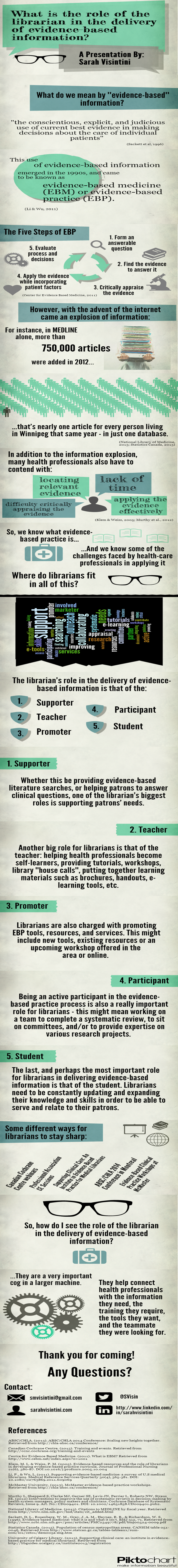
One of the challenges of advertising library events on college campuses is the non-stop barrage of publicity emails, flyers, posters, and announcements that fly around campus. Whether it’s the ultimate frisbee team’s bake sale fundraiser or the theater department’s latest dance performance, somewhere on campus someone is holding an event. The preponderance of “stuff” going on increases the need for targeted, engaging and attractive advertising for library events.

This is where our latest submission comes in.

Brandon Scheirman, Marketing and Graphic Arts Associate at the Pepperdine University Libraries, created a series of posters using Adobe Illustrator advertising a guitar students’ concert, a part of a monthly concert series held at the library.

Guitar Series Poster Blue

My library holds a monthly classical guitar concert in one of its rooms and my job was to create a series of posters that advertised these concerts in a clear and classy manner. I wanted to go for a little bit of a retro feel that brought color and bold images to the library, which is something that the library has struggled with. These posters have been widely recognized across campus and brought the events together as a cohesive series.


Guitar Series Poster Green

Brandon’s posters are a beautiful example of unifying different designs through the repetition of common elements. In this case, he maintains consistent use of typography and imagery by repeating the same font in different colors as well as the same guitar from different angles. The library logo remains unobtrusive but still present, letting the fantastic, bold poster design shine through.

Guitar Series Poster Red
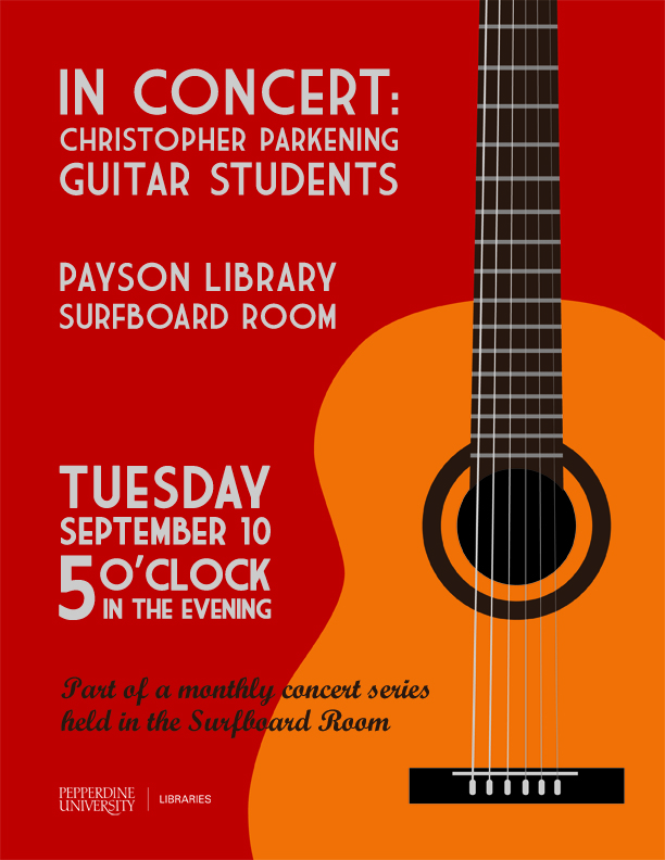
If you’re interested in learning more about how these posters were created or obtaining a copy of the Illustrator files, please email Brandon Scheirman.

Visualizing Research is Hard

I’ve been working on a poster for my institution’s ACRL Assessment in Action project for the past month or so and it’s easily been one one of the toughest things I’ve had to design EVER. With ALA and other summer conferences around the corner, I’m willing to bet there are plenty of librarians and library students in epic-poster-design-battle-mode at the moment. So let’s talk posters, research and pictures.

To sum up our AiA Project: The St. Mary’s College of Maryland team was interested in learning if faculty-librarian collaboration had an impact on students’ information literacy (IL) skill development in the First Year Seminar (FYS: a required course for all first year students). It was a multi-method assessment: student surveys, faculty surveys, librarian surveys, rubric-based assessment of student essays and faculty interviews. This made coming up with a poster design particularly challenging since there was simply SO MUCH INFORMATION to share.

After hearing from an AiA cohort member who was taking a really simple, conversational approach to designing her project poster, I knew that I wanted to try to replicate that approach as much as possible. There is only so much information you can take in from a poster, and I would much rather be talking to people about different aspects of my project than having them squinting at the text above my shoulder.

AiA-Poster-Draft-small

I still think the poster is kind of busy, but to be honest, I’m so tired of it right now that I’m willing to let it go through the AiA peer review process and worry about it next week. It still needs alignment adjustments, and I’m not totally sold on the white font on the blue background, but it’s something!

Here are the pieces I like best:

Methods: All of our assessment pieces were part of a greater whole, and took place at various points throughout the semester. I was inspired by other AiA colleagues who took a timeline approach to their methods section and thought this was a nice compromise.

methods

Research Question & Background: This was originally a long paragraph with background information about our First Year Seminar, our IL outcomes, and our assessment project. I decided that if someone really wanted the long story, they could visit our project website (which I’m in the process of developing) or just ask me more about it. I paired down the research description to the just the essential question and basic facts about the FYS and our involvement with it.

question

Results: This is just a portion of the results section, which was easily the most difficult section to develop. I’m still not totally pleased with it, but I wanted to try something other than bullet points and graphs. I don’t know if I did the right thing leaving out numbers and I may go back and change that, but again, I think if people want the finer details I can refer them to the project website with averages, t-test scores and correlation scores, right (I hope)?

results

What kind of posters are you working on for conferences this summer? What’s your approach to visualizing your research?


Read the Rainbow

Read the Rainbow: Literacy in Pantone SwatchesWe’ve featured a few different book displays on Librarian Design Share since our blog began, and I have to admit they’re my secret favorite thing to post. I don’t really get the opportunity to create displays for my library, so I think posting other people’s displays is my way of filling a personal design void.

This fantastic display comes to us from Leanne Mobley, MLS Candidate at Indiana University and the Center Supervisor at the Willkie Library, Indiana University Residential Programs & Services Libraries.

Read the Rainbow: Literacy in Pantone SwatchesHere’s Leanne in her own words:

For the month of April, I put together a “Read the Rainbow” display to highlight our fiction collection. The display is an homage to the classic Pantone paint swatches. I rounded up a handful of books with vibrant covers and then used the eyedropper tool in Illustrator to select the main color featured.

I also ransacked the paint swatches at our local hardware store and covered our bulletin board. We mostly circulate DVDs and music, but our patrons are really enjoying the display and seem to be taking notice of our fiction collection.

Read the Rainbow: Literacy in Pantone Swatches

April and I both love classic look of Pantone color swatches and can easily see this display replicated in academic, school, and public libraries. Really any library with a fiction collection would be able to do this!

If you have questions about the display, leave a comment. For the Illustrator files that accompany this display, contact Leanne directly.

Color Palettes From Your Favorite Images

At the ALA Midwinter ACRL Marketing Discussion Group, a librarian shared a great little online color palette generator with me, and I, in turn, am sharing it with everyone else.

The DeGraeve Color Palette Generator will create two color palettes based on a photo URL, one vibrant, one dull. Take a look at it in action:

degraeve color palette generator

It’s a great tool to use whenever you’re building a flyer, poster, or web design around an image.

Good Design Doesn’t Happen Alone


On Saturday I gave a short talk at the ACRL Marketing Discussion Forum at ALA Midwinter. The whole presentation, as you can tell from the title slide, was about using the people and communities around you to help you create better, more engaging visual materials for library marketing and outreach efforts. It may have been cold enough in Philly to make me wish I was in Texas in July, but the conversation at our discussion was lively and warm! I had a blast. Big thanks to Katy Kelly and Jessica Hagman for inviting me to participate, and I hope y’all enjoy the slides.

This presentation was created using Photoshop. Images were saved as PNG files and layered onto a Google Slideshow. For any of the original Photoshop files, email me, Veronica.

Changing it Up a Little

April and I started this blog last December, and since then, we’ve been so impressed with the designs you’ve shared with us. In an effort to better showcase new designs and mix things up a bit, we’ve given Librarian Design Share a little face lift.

New year, new theme, new layout.

You can still search the blog for design inspiration, and all of our category, tag, and archive information are available in the site footer.

Hope y’all enjoy the changes around here.

DIY or Prefab it?

It’s a question we’ve all asked ourselves at one point or another. We might be under a tight deadline to create a presentation for a class or a series or brochures for an event. We weigh out our time constraints against the creativity raging inside our brains, our proficiency with design tools, and our desire to work on a particular design piece. Then we come back to our question: Do I DIY it or Prefab it?

At Librarian Design Share, April and I have made it a point to share original designs created by library-related folks for library-related purposes. Your designs are AH-MAZING (and of course we want to encourage you to keep ’em coming). We would of course, be remiss if we didn’t acknowledge the role that prefab designs play in our work. In fact, one could argue that, since all designs on Librarian Design Share are available for adaptation and resuse, this blog is in fact a sort of prefab design site.

If you aren’t familiar with traditional prefab design sites, just think of Microsoft Publisher or PowerPoint Templates on steroids. Some of the more popular flyer and infographic creation sites out there are ones like:

They offer a variety of attractive templates that can be customized to varying degrees to meet your design needs. Many retain some kind of a branding presence on the end result (a logo, a link to their homepage, etc.), but it’s a small price to pay for a good-looking end result. Some of these sites allow for much more customization than others. Piktochart is definitely on the more customizable end of the spectrum.

Take for example, Sarah Visintini, System Administrator at the Social Media Lab at Dalhousie Unviersity in Halifax, Nova Scotia, who used Piktochart to it’s most creative effect. Here are two infographic presentations she created using a blank Piktochart template and all of the many elements available through this site:

social media in health

Social Media in Health Care: How social media can help you better connect to your patients and to your community.

Using and infographic to present is a visually engaging way to relay information that takes you outside of the normal PowerPoint / Prezi mold.

So when do you use prefab sites? Or do you always DIY?

Video Slidedeck Theme

Earlier this month I presented at the Brick & Click Academic Libraries Symposium on a student-led library video project I started at St. Mary’s. This post is not about that project. But it is about slidedecks and how, when given the opportunity to make things easy, I make things more difficult for myself. BECAUSE THAT’S THE KIND OF GAL I AM.

I wanted a fun video-related theme running through my presentation slides and decided to upcycle a poster I had originally created to publicize our library’s new Films on Demand subscription. I changed around some fonts (using Arvo and Sofia Pro Light), added some movie-related icons and other graphic elements through-out and BLAM-O, a new template was born. It was really more of a time-consuming why-did-I-decide-to-do-this creation rather than a spontaneous design, but I’m happy with the final project and hoping that by sharing it I can save some people some time.

I’ll end with a brief exchange I had with my husband about this slidedeck:

ME: Check out my presentation slides!!!!!
HIM: Cool. I didn’t know Powerpoint had that theme.
ME: It doesn’t. I made my own theme.
HIM: Of course you did. *head pat*

You can check out the embedded slidedeck through Slideshare, or email me, Veronica, for the original PP slides and Photoshop layout.


Advertising Ebooks

My library is currently taking part in a demand-driven acquisition ebook pilot project through Proquest’s EBL and our state college and university library consortia. The challenge: advertise that mouthful to our students, faculty and staff. The solution: A mix of attention getting posters, slides for our website image carousel, as well as pamphlets and an accompanying libguide that go into more detail about the program and give our users instructions on how to access and download these ebooks.

ebook dda pilot poster advertisement

After struggling to coming up with an interesting, non-cheesy way to visually represent ebooks, I found the photo above on Flicker, and thanks to its creator Johan Larsson’s generous CC 2.0 Attribution license, I was able to build a design around it. I cut out most of the background, layered it on a black background and used Cicle font to create a slogan that is (I hope) intriguing but still meaningful. I decided against including a QR code because previous efforts at including them in signs for my library showed that none of the students were using them. The posters will be placed on bulletin boards in various academic buildings around campus.

I then adapted the poster design to a smaller scale: our website’s image carousel:

ebook pilot image carousel slideThis slide links out to a libguide about the ebook pilot project. Created by my colleague, Alana Verminski, the libguide offers more detail about the program and gives detailed instructions for users to locate, access, and download or print portions of the ebooks. Alana also did a fantastic job of creating a tri-fold brochure about the ebook pilot project which we’re sharing at our library’s information desk for those who want to take away information about it.

Ebook Brochure Inside Ebook Brochure OutsideThe poster and image carousel slide were created using Photoshop and the tri-fold brochure was created using Word. For the original files of any of these designs, please email Veronica Arellano Douglas.

Create a free website or blog at WordPress.com.

Up ↑