Search

Librarian Design Share

inspiration for library creatives

Author

Veronica Arellano Douglas

Instruction Coordinator at the University of Houston Libraries

Taking Advantage of Cover Art

Book Club AdvertisementSometimes the image you have to work with is so attractive that it should be the center piece of your flyer or event advertisement. I think the cover art and color scheme for The Dog Stars by Peter Heller is just beautiful. The easiest thing for me to do was just include a picture of the book! I think the advertisement is brief and graphic and gets the job done. The font is 5 Minutes from FreeTypography.com.

For the original Photoshop files, email Veronica Arellano Douglas.

An Icon for Library Mobile Apps

Library, bookstackFrom Michael Schofield, at the Alvin Sherman Library, Research, and Information Technology Center at Nova Southeastern University:

Our university has an iOS and Android app called iShark. So, the library originally had zero presence within that hub, which essentially was linked out to the websites for Athletics and Dining and Parking, etc.(even though ours was the only responsive website university-wide [but I digress …]). Eventually, things came together and I had to create a graphic that was immediately identifiable as a button smaller than the average thumb. This is what I did. I figured that since we had no need to include our library’s full name, this graphic is widely applicable and I wanted to share.

Thanks for sharing your design, Michael. This is a great graphic for anyone looking for a mobile icon for their library. For the original Photoshop file, email Michael Schofield.


Attack of Too Much Information: Workshop Advertisements

EndNote Workshop FlyerEndNote-workshop-sliderThis was an email and web flyer created to advertise our library’s upcoming EndNote workshop series. I always struggle with how much info to put on a flyer. I obviously want to give the pertinent details about an event, but sometimes I just feel overwhelmed by text. I always try to keep it graphic and balance out chunks of texts by changing up font sizes and colors when possible. The ad for our website (second image) left out a lot of details and just linked to our library’s blog post. I like it a lot more! It’s just so much cleaner.

How do you balance out event info on a flyers while still maintaining a visually appealing ad?

For the original Photoshop files, email Veronica Arellano Douglas.

Oh No You Didn’t Just LOLCat Us

U help make liberry site student friendleeeeeDespite years of resistance, I LOLcat-ted. I blame it on the abundance of Creative Commons licensed photos of cats and computers on Flickr. Using Photoshop’s always handy magnetic lasso tool, I cut Mr. Kitty out of his cute photo and used him to promote our library’s call for website usability testing volunteers. The font is Impact and the photo is from Flickr user mastrobiggo.

For the Photoshop file of this slide, email Veronica Arellano Douglas.

Design Aids: Picking the Right Palette

Picking colors is hard, ya’ll. Whenever I’m creating visual materials for my library I often spend way too much time trying to find colors that are interesting but not overwhelming, and more importantly, look good together. Before I know it I’ve spent the the better part of an hour deciding on just the right shades of grey and orange. It’s a problem.

Two web-based tools I often turn to in the pursuit of color perfection are COLOURLovers and Colorzilla.

colourlovers

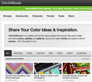
COLOURLovers is a great source for interesting palettes, patterns and just plain pretty colors. For the more design adventurous, you can also create your own patterns on this site or download shapes to create new patterns in Photoshop or Illustrator.

colorzilla

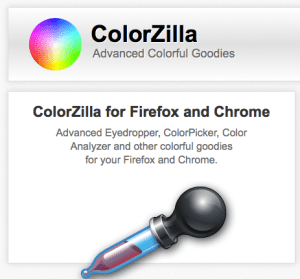
Colorzilla is a browser extension for Firefox and Chrome. It basically gives you a Photoshop-like color picker that you can use with anything you see online. Browsing the web and run across the perfect shade of green? Use Colorzilla and pick it! You can than use that color just about anywhere. Colorzilla also comes with a CSS generator, which I have yet to use, but seems really handy for developing gradients and color shading on websites. I use Colorzilla on an almost daily basis and it has been an invaluable tool for me as I continue to design and re-design my library’s website.

What are your favorite color-related design aids?
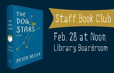
Share the Printing Love this Valentine’s Day

Your Computers and Our Printers have a newfound connection. http://guprint.gonzaga.edu

Like us on Facebook. It makes cents! Like Foley Center Library on Facebook through Valentine's Day and earn 25 cents in your Pharos printing account.These cheerful Valentine’s Day themed designs come to us from Zoe Mayhook at the Foley Center Library at Gonzaga University who created these slides for her library’s digital display.

The first is a slide for our online print service. Students are now able to print from their laptops on to our computers. The concept: anything is eye-catching when you add googly eyes. The second was a slide I created for our Facebook promotion. If students liked us on Facebook, we put .25 cents on their print account.

I am a novice library ad designer (no real prior experience), so I look forward to sharing my ideas and seeing what other people are doing!

Thanks for the submission, Zoe! We totally agree about googly eyes, by the way.

For the original Powerpoint slides, email Zoe Mayhook.

A Little Help from Stormtroopers

Internet Service Disruptions AdvertisementI love building on fun photos to convey information that would otherwise be dry and boring. This little announcement ended up on our library’s website after our IT department warned us about upcoming internet service upgrades that would impact students’ access to the network and the library’s resources.

For the original Photoshop file, email Veronica Arellano Douglas. The photo is available online through Flickr and can be reused and adapted.

ALA Event Flyer

ALA Instruction Section's Discussion Group flyer for ALA Midwinter 2013This is a flyer I created to advertise ACRL’s Instruction Section’s Discussion Group session at the upcoming ALA Midwinter Meeting. I picked up the great image from Microsoft’s clipart/stock photo library (thanks for the tip, April!) and tried to tie in some of the colors from the image in the background areas and text.

For the original Photoshop file, email Veronica Arellano Douglas.

Hand-lettering and Sketchy Goodness

Change in Library Hours AnnouncementAs you can tell by the header on this website, I’m a sucker for sketchy designs and hand-lettered fonts. I don’t get to use them very often when creating visual materials for the library, so I decided to sneak them into this announcement slide on our library website.

Dafont.com is a great source for free fonts, including handwritten styles. The ones used above are Claire Hand (from Dafont) and Chalkduster (which I believe comes standard with most computers). The clock is a modification of a sketch from Flickr user Xv.

For the original Photoshop file, email Veronica Arellano Douglas.

Create a free website or blog at WordPress.com.

Up ↑