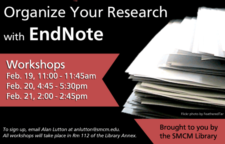
 This was an email and web flyer created to advertise our library’s upcoming EndNote workshop series. I always struggle with how much info to put on a flyer. I obviously want to give the pertinent details about an event, but sometimes I just feel overwhelmed by text. I always try to keep it graphic and balance out chunks of texts by changing up font sizes and colors when possible. The ad for our website (second image) left out a lot of details and just linked to our library’s blog post. I like it a lot more! It’s just so much cleaner.
How do you balance out event info on a flyers while still maintaining a visually appealing ad?
For the original Photoshop files, email Veronica Arellano Douglas.

February 14, 2013 at 2:34 pm
I dig the contrasting colors and that ribbon! I’m usually not a fan of shadow fonts anymore (I used them too much for a long time and burned out), but here I think it’s effective because the words really pop off your ribbon.