Search

Librarian Design Share

inspiration for library creatives

Category

Flyers & Advertisements

DIY or Prefab it?

It’s a question we’ve all asked ourselves at one point or another. We might be under a tight deadline to create a presentation for a class or a series or brochures for an event. We weigh out our time constraints against the creativity raging inside our brains, our proficiency with design tools, and our desire to work on a particular design piece. Then we come back to our question: Do I DIY it or Prefab it?

At Librarian Design Share, April and I have made it a point to share original designs created by library-related folks for library-related purposes. Your designs are AH-MAZING (and of course we want to encourage you to keep ’em coming). We would of course, be remiss if we didn’t acknowledge the role that prefab designs play in our work. In fact, one could argue that, since all designs on Librarian Design Share are available for adaptation and resuse, this blog is in fact a sort of prefab design site.

If you aren’t familiar with traditional prefab design sites, just think of Microsoft Publisher or PowerPoint Templates on steroids. Some of the more popular flyer and infographic creation sites out there are ones like:

They offer a variety of attractive templates that can be customized to varying degrees to meet your design needs. Many retain some kind of a branding presence on the end result (a logo, a link to their homepage, etc.), but it’s a small price to pay for a good-looking end result. Some of these sites allow for much more customization than others. Piktochart is definitely on the more customizable end of the spectrum.

Take for example, Sarah Visintini, System Administrator at the Social Media Lab at Dalhousie Unviersity in Halifax, Nova Scotia, who used Piktochart to it’s most creative effect. Here are two infographic presentations she created using a blank Piktochart template and all of the many elements available through this site:

social media in health

Social Media in Health Care: How social media can help you better connect to your patients and to your community.

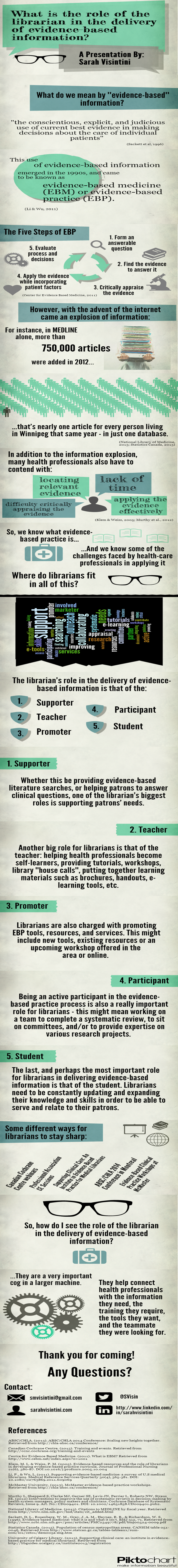
Using and infographic to present is a visually engaging way to relay information that takes you outside of the normal PowerPoint / Prezi mold.

So when do you use prefab sites? Or do you always DIY?

Advertising Ebooks

My library is currently taking part in a demand-driven acquisition ebook pilot project through Proquest’s EBL and our state college and university library consortia. The challenge: advertise that mouthful to our students, faculty and staff. The solution: A mix of attention getting posters, slides for our website image carousel, as well as pamphlets and an accompanying libguide that go into more detail about the program and give our users instructions on how to access and download these ebooks.

ebook dda pilot poster advertisement

After struggling to coming up with an interesting, non-cheesy way to visually represent ebooks, I found the photo above on Flicker, and thanks to its creator Johan Larsson’s generous CC 2.0 Attribution license, I was able to build a design around it. I cut out most of the background, layered it on a black background and used Cicle font to create a slogan that is (I hope) intriguing but still meaningful. I decided against including a QR code because previous efforts at including them in signs for my library showed that none of the students were using them. The posters will be placed on bulletin boards in various academic buildings around campus.

I then adapted the poster design to a smaller scale: our website’s image carousel:

ebook pilot image carousel slideThis slide links out to a libguide about the ebook pilot project. Created by my colleague, Alana Verminski, the libguide offers more detail about the program and gives detailed instructions for users to locate, access, and download or print portions of the ebooks. Alana also did a fantastic job of creating a tri-fold brochure about the ebook pilot project which we’re sharing at our library’s information desk for those who want to take away information about it.

Ebook Brochure Inside Ebook Brochure OutsideThe poster and image carousel slide were created using Photoshop and the tri-fold brochure was created using Word. For the original files of any of these designs, please email Veronica Arellano Douglas.

Remixing Old Designs

Last December I shared a sign I created for our reference desk advertising our library’s chat reference service and LibAnswers Knowledgebase. I love it when designs on our site get remixed and re-purposed. Erica DeFrain of Honey-Badger-Boolean fame switched up the sign’s layout, “fussed with the text,” and of course, changed colors to match her home institution. The result is below:

Ask us sign for the U of VTAwesome, Erica! If you’ve adapted any of the designs on our blog, let us know! We’d love to feature them here.

Grab Some Popcorn

We recently moved our entire DVD collection out to the open stacks in our library. They used to be behind the circulation desk, and anyone who wanted to check out a movie had to look up a title and request it or browse through pages and pages of our DVD listings in a printed binder.

To celebrate our new browsable DVD collection, we toyed around with featuring librarian and library staff movie recommendations on the tops of the shelves and via social media. I came up with the posters below. They’re my less creative, i-can’t-use-illustrator-so-photoshop-will-suffice versions of these minimalist children’s book covers and re-imagined movie posters. I also threw in an advertisement for our library’s new Films on Demand Subscription, to go along with our movie emphasis.

Citizen KaneFilms on Demand Poster

I didn’t get a chance to brand the posters for our library, and ultimately, our library decided to go in a different direction with the publicity efforts. Even though these posters didn’t get used I thought they were still worth sharing in the event that someone else might use them or be inspired to great better versions!

Muriel's WeddingEternal Sunshine of the Spotless Mind

If you’re interested in the Photoshop files of these posters, email Veronica Arellano Douglas.

Branding Your Library

We librarians tend to make a lot of help sheets and signage to assist patrons as they use our resources.  That’s really what Librarian Design Share is about, right?  But even with best intentions, we don’t always fully think about the way our publications as a whole look and feel to our patrons.

I think Librarian Design Share would be remiss if we didn’t talk standardizing the look of your library’s publications, or branding, if you will.  Brands can highlight something unique about your community (perhaps it’s near water or you’re known for an historical event), your library (maybe you have an awesome stained-glass window or a spiral staircase), or it can be based on something more abstract, like colors, shapes, or even text.  We based our library branding on the pretty rainbow of colors our bound journals make on the shelves.  Everyone has bound journals on their shelves, but there’s something about the color arrangement and the mass amount of them that make the way they look in our large, light-filled space memorable. Here’s our general publication header that can be copied to any document:

new brand

Whatever standardization you decide upon should happen across the board–from all the pieces of paper that a patron might see in your library to your web presence. This is our website’s look:

8-6-2013 12-10-59 PM

I thought my library was well on the way to doing this, but a quick audit of our documents online and on our slat wall exposed at least three previous brands that are still in use on our handouts.

old brands

Yikes, you know what my new project is…

Think about it terms of your favorite store: their shopping bags have the same look as their store signage as their website, right? So should our libraries.  It’s about making things more consistent in the minds of our users. More simply, it’s about showing our users that we care enough to keep things updated, neat, professional, and easy for them to digest.

If you have great examples of a branding campaign you’ve created and implemented at your library, we’d love to see them! Consider submitting them to our site and sharing them with your colleagues.

When Your Library’s Blog Needs a Little Push

Like a lot of libraries, the St. Mary’s College of Maryland Library has a blog. The librarians (and some of our library staff) are rotating contributors, and we try to cover everything from interesting stuff in our print and online collections to events to what’s going on in the info-verse. It’s a mixed bag, but we like it that way.

Although we offer plenty of ways for our campus community to subscribe to content updates (Twitter, RSS, Email), I haven’t been super successful at increasing our number of subscribers. So to make sure that people know about our blog, I try to highlight our posts on our library website’s image carousel. Here are my latest efforts:

Learn about weeding in the library
Photo Credit: Chickweed forest by Wayne Marshall on Flickr.
A St. Mary's Librarian at the NYPL
Photo Credit: Image by SMCM Librarian Alana Verminski
Who's that pre-1941 alumna?
Photo Credit: Image from the St. Mary’s Library Archives

How do you highlight your library’s blog?

For the original Photoshop files of these slides, email Veronica Arellano Douglas.

Promoting eResources in the Stacks

American Film Scripts Online

If your stacks are anything like ours then unused advertising space abounds. Our shelf end-caps have small signs with call number ranges on them and not much else. Theresa Mudrock and her colleagues at the University of Washington Libraries are “experimenting with posters in the stacks to highlight specific databases, subject guides and subject librarians.” It sounds like a fantastic use of dead space.

Oxford Bibliography Poster - Buddhism

This poster, created on MS Publisher, promotes our newly acquired module of Oxford Bibliographies. Similar posters were made for other modules including Hinduism, Political Science, etc. The posters were placed in the book stacks in the call number areas for the subject.

It’s a simple but effective marketing technique. Users are already looking for books in a particular subject area, so why not point them to other helpful resources?

ASFA Poster

For the original Publisher files of these posters, email Theresa Mudrock.

What Did You Do Today?

Often we create a single design to promote a library event, but every now and then an event is so important that it deserves an entire marketing campaign.  This was the case for Maryland Day.

Rebecca Hopman, Special Collections Coordinator and Instruction & Outreach Team Member at the University of Maryland, says:

Each year our university hosts Maryland Day, an annual open house for the community, prospective students, and current students, faculty, and staff. The event is a chance for academic departments, campus offices, and local community organizations to connect with visitors. The UMD Libraries ran several events, most of which were held in Hornbake Library and McKeldin Library. Our team created promotional materials to advertise the UMD Libraries’ events and our “What did you do today?” social media campaign, including posters, a library website ad, TV monitor slides, and postcards for people to take with them or mail to a friend or family member.

poster

Poster created using Publisher

mailsign1

Mail Bin Sign created using Photoshop

Picture1

Postcard created using Publisher

slide5

TV monitor slide created using PowerPoint

We wanted to keep the design fun, simple, and colorful, so we used our official university colors (red, yellow, black, and white) as well as Maryland Day colors (bright red, green, blue, orange, and purple). For the postcards and slides we took original photos of our activities, and we used images from our digital collections to advertise the fact that we would stamp and mail postcards for people who wanted to send them to friends and family members. With each design, we tried to keep the amount of information to a minimum and emphasize the sharing/online component.

Wow, right?  Everything UMD has done here is awesome, but I especially enjoyed the social media aspect, because you can see how much the community enjoyed the event!

Rebecca and her colleagues, Laura Cleary, Special Collections Coordinator and Instruction & Outreach Team Leader, and Sarah Espinosa, Graduate Student Assistant and Instruction & Outreach Team Member, used a variety of programs to best suit their creative needs.  For the original files of any of the designs, contact Laura Cleary.

Advertising New Services

Libraries are adopting new technologies all the time.  But how do you get the word out about the new services to patrons?

Ernesto Hernandez, the Emerging Technologies Librarian at Marydean Martin Library at Nevada State College shared two recent designs he created to advertise new services.  About the iPad circulation sign below, Ernesto says, “although it is simple in design, I took an original picture of the iPad with my phone camera along with inserting a QR Code to our iPad LibGuide.”

iPad sign e hernandez

The second design Ernesto shared is a bookmark to promote his library’s newly created social media sites.  The library intends on inserting one into each book they check out.  Ernesto says, “we added our library symbol and phrase ‘Get Social with the Marydean Martin Library’ along with shortened URLs to each page.”

socialmediabookmark e hernandez

Using original designs, uniquely branding them to your own library, and placing them where patrons can’t help but notice them is a great way to promote services to patrons.

Want the original Publisher files of either of these documents?  Contact Ernesto Hernandez.

Create a free website or blog at WordPress.com.

Up ↑