Search

Librarian Design Share

inspiration for library creatives

Category

Flyers & Advertisements

Visualizing Collections

afro-am-imprints

We’re nearing the end of the fiscal year at my library, which means we’re in a mad dash to spend our acquisitions budget. As a result we have a number of different databases on trial at the moment. Each of these slides appears on our library’s website and are meant to draw people in to the database content.

It’s a tricky thing to do. Databases are not often considered “sexy” and unless they’re archival collections with interesting images like the Afro-Americana Imprints, it can be difficult to draw users in to check them out.

latin-american-newspapers

I created each slide in hopes that they would catch the eyes of our students and faculty and introduce them to a new resource. I’ll let you know if they work!

For the original Photoshop files, email Veronica Arellano Douglas.

Kindle Inspiration

Kindle is hereThis submission is a great example of what we hoped Librarian Design Share could do. Here’s what Bohyun Kim from Florida International University Medical Library has to say about her new Kindle lending program advertisement:

This is a poster I created [using Photoshop] for my library’s new Kindle e-book reader lending program sponsored by the National Network of Libraries of Medicine/Southeast Atlantic Region Express Mobile Technology Project Award. The poster will be printed on a large glossy paper (36′ x 24′). This poster design has been inspired by the circulation desk signage of Saint Mary’s College of Maryland Library featured on Library Design Share back in December.

You can read more about Bohyun’s poster creation on the ACRL Tech Connect blog (which, if you’re not reading, you should definitely checkout!). If you’ve been inspired by any of our posts, we’d love to feature your adaptations.

For the Photoshop file of this poster, email Bohyun Kim.

New Designs For an Image Carousel

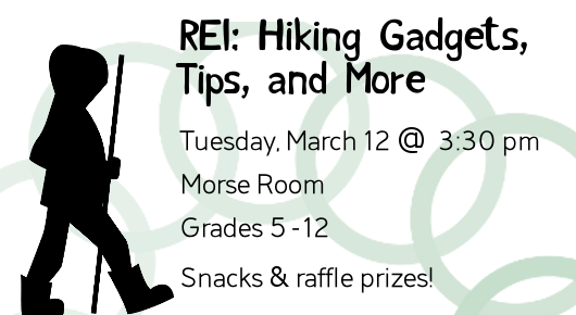
REI Hiking, Gadgets, Tips, and More

Today’s designs come from Becky Schneider, Reference Librarian & Webmaster at the Morse Institute Library. After adding an image carousel to her library’s website, Becky’s been brushing up on her self-taught graphic design skills.

Magazine of the Week AdvertisementHere’s Becky’s view on her design work:

I try to keep my designs minimal but still varied in look and feel. I work in GIMP[the GNU Image Manipulation Program]. My graphics and fonts are from the Open ClipArt Library and Open Font Library. I’ve learned so many good tips from The Non-Designer’s Design & Type Books by Robin Williams (not that Robin Williams).

I’m curious about how other small to medium-sized libraries divvy up design and publicity-related duties. I do graphic design for the web, staff do flyers for their own programs and displays, and our outreach person writes for external media. Signage, other than our primary locational signage, is a bit miscellaneous. If anyone wants to share their own experiences with managing publicity and design in the comments, I’d be interested.

How do you manage design and publicity in your own libraries?

For the original GIMP files of these slides, email Becky Schneider.

Taking Advantage of Cover Art

Book Club AdvertisementSometimes the image you have to work with is so attractive that it should be the center piece of your flyer or event advertisement. I think the cover art and color scheme for The Dog Stars by Peter Heller is just beautiful. The easiest thing for me to do was just include a picture of the book! I think the advertisement is brief and graphic and gets the job done. The font is 5 Minutes from FreeTypography.com.

For the original Photoshop files, email Veronica Arellano Douglas.

Attack of Too Much Information: Workshop Advertisements

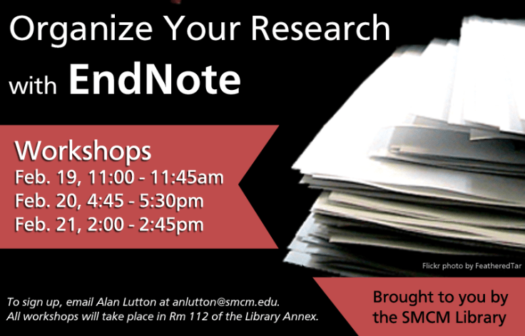
EndNote Workshop FlyerEndNote-workshop-sliderThis was an email and web flyer created to advertise our library’s upcoming EndNote workshop series. I always struggle with how much info to put on a flyer. I obviously want to give the pertinent details about an event, but sometimes I just feel overwhelmed by text. I always try to keep it graphic and balance out chunks of texts by changing up font sizes and colors when possible. The ad for our website (second image) left out a lot of details and just linked to our library’s blog post. I like it a lot more! It’s just so much cleaner.

How do you balance out event info on a flyers while still maintaining a visually appealing ad?

For the original Photoshop files, email Veronica Arellano Douglas.

Oh No You Didn’t Just LOLCat Us

U help make liberry site student friendleeeeeDespite years of resistance, I LOLcat-ted. I blame it on the abundance of Creative Commons licensed photos of cats and computers on Flickr. Using Photoshop’s always handy magnetic lasso tool, I cut Mr. Kitty out of his cute photo and used him to promote our library’s call for website usability testing volunteers. The font is Impact and the photo is from Flickr user mastrobiggo.

For the Photoshop file of this slide, email Veronica Arellano Douglas.

Promoting Classes

class offerings

Sometimes the most basic information can be the hardest thing to represent graphically. This flyer was created to promote our regular library class offerings.  Like a lot of the pieces I make, I utilized more than one Microsoft Office program.  I created the chart in Word because I prefer it over Excel for building charts with a bunch of text, and then I copied the chart to a Publisher document so that I could play with the colors, lines, and layer the images, which is way easier to do in Publisher than Word.  I’m not going to lie; it took me forever to decide on the colors and to fit all that I wanted to say in the limited space to make it a half-page document (color printer guilt), but now that it’s done, we can revise and reuse it each semester.

If you are interested in the Publisher file for this document, contact April Aultman Becker.

Share the Printing Love this Valentine’s Day

Your Computers and Our Printers have a newfound connection. http://guprint.gonzaga.edu

Like us on Facebook. It makes cents! Like Foley Center Library on Facebook through Valentine's Day and earn 25 cents in your Pharos printing account.These cheerful Valentine’s Day themed designs come to us from Zoe Mayhook at the Foley Center Library at Gonzaga University who created these slides for her library’s digital display.

The first is a slide for our online print service. Students are now able to print from their laptops on to our computers. The concept: anything is eye-catching when you add googly eyes. The second was a slide I created for our Facebook promotion. If students liked us on Facebook, we put .25 cents on their print account.

I am a novice library ad designer (no real prior experience), so I look forward to sharing my ideas and seeing what other people are doing!

Thanks for the submission, Zoe! We totally agree about googly eyes, by the way.

For the original Powerpoint slides, email Zoe Mayhook.

A Little Help from Stormtroopers

Internet Service Disruptions AdvertisementI love building on fun photos to convey information that would otherwise be dry and boring. This little announcement ended up on our library’s website after our IT department warned us about upcoming internet service upgrades that would impact students’ access to the network and the library’s resources.

For the original Photoshop file, email Veronica Arellano Douglas. The photo is available online through Flickr and can be reused and adapted.

Blog at WordPress.com.

Up ↑