Paseo Verde Library in Nevada has the same problem that many libraries do: patrons who loudly carry on phone conversations without regard for those around them. Instead of shushing or putting up passive-aggressive signage that no one reads, Virtual Branch Librarian Tawnya Shaw designed something that clearly conveys the message with an image that might just cause patrons to do a double-take:
To create this eye-catching design, Tawnya used Photoshop to alter a piece of Victorian clip art and Rockwell font for the text. The combination of image, font, and white space make this vintage design somehow feel very modern and effective.
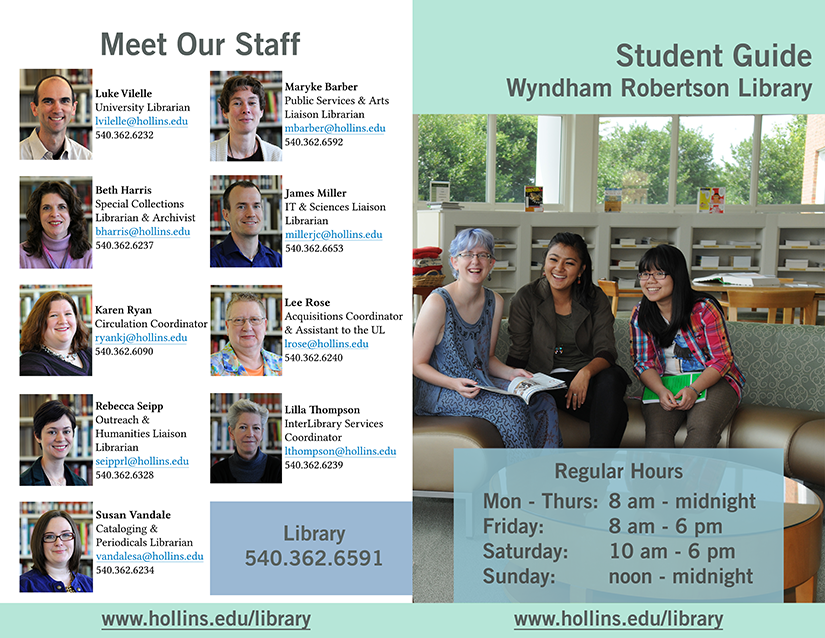
Big thanks to Rebecca Seipp, Outreach & Humanities Liaison Librarian at the Wyndham Robertson Library at Hollins University, for being one of our first Back-to-School design features. Rebecca’s sharing the “Guides to the Library” brochures for students and alumni that she recently revised. These kinds of publications are so tough to pull together. Information changes constantly, and it’s always a balancing act between including information that you think will be helpful and not bombarding people with too much text. I think Rebecca strikes a fantastic balance.
Student Library Guide – Front & Back
Here’s Rebecca talking about her work on these brochures:
This summer I updated our alumnae and student guides at the library. Over the past few years information was continually added to these guides without any redesign. Predictably, that resulted in guides that were dated and dense. My goals for the new guides were twofold: to create a clean look and to include just enough information to highlight our services and keep people interested. All the images were taken by university marketing and the primary colors are from the university’s color palette. Both guides were created in Photoshop and are designed to be printed front/back and folded vertically. You’ll notice that the student guide has text on the inside middle – since it’s only one page when folded the text is still easy to read and it adds an unexpected design element.
Student Guide – Inside
You can see that the guides for alumni are targeted to their specific population and make nice use of a stunning shot of the library and a calm color palette.
The Hollins University logo was removed from the back side of the alumnae guide and replaced with text that says “your logo here.”
When creating the student guide I accidentally flattened the back that has the staff pictures – oops! So what I did is created the boxes and text in the boxes as separate layers and then just have the images grouped together as one layer. So the bones will still be there, but there won’t be any guides for the size of images and text boxes for librarian info.
Thanks for the heads up, Rebecca, and thanks for sharing!
Alumnae Guide – Front and BackAlumnae Guide – Inside
Nono Burling, Online Resources Coordinator at Washington State Library and manager of the ASK WA Virtual Reference Project, first shared this amazing chalkboard-style poster design on the ACRL Library Marketing and Outreach (LMaO) Facebook group, and we are so excited to feature it here today. It’s a good example of trying something new with conference poster design and makes great use of interesting fonts. Here’s Nono talking about her design process:
I’d originally been asked to present at the College Librarians and Media Specialists of Washing State (CLAMS) 2014 fall conference, but due to time constraints my presentation turned into a poster session. I wanted something eye-catching that would draw people. I’ve always loved those chalkboard designs you see in coffee shops so decided to try one of my own. The “Sneak Peek” part of the poster is a lift-the-flap piece. The entire design goes on a 36″ by 48″ tri-fold poster board.
Here are some of the fonts I used in this design for both the text and ornamental pieces, all free to download:
The start of the fall semester is a crazy time for those of us who work in school or academic libraries. There are usually orientations for new undergrads, grad students and faculty; open house events for prospective students; and plenty of campus tours that highlight the awesomeness of our libraries. We know many of you out there have put together some amazing orientation materials for your libraries and we’d love to feature them. Brochures, websites, buttons, stickers–if you used them at the start of this semester, we want to see them.
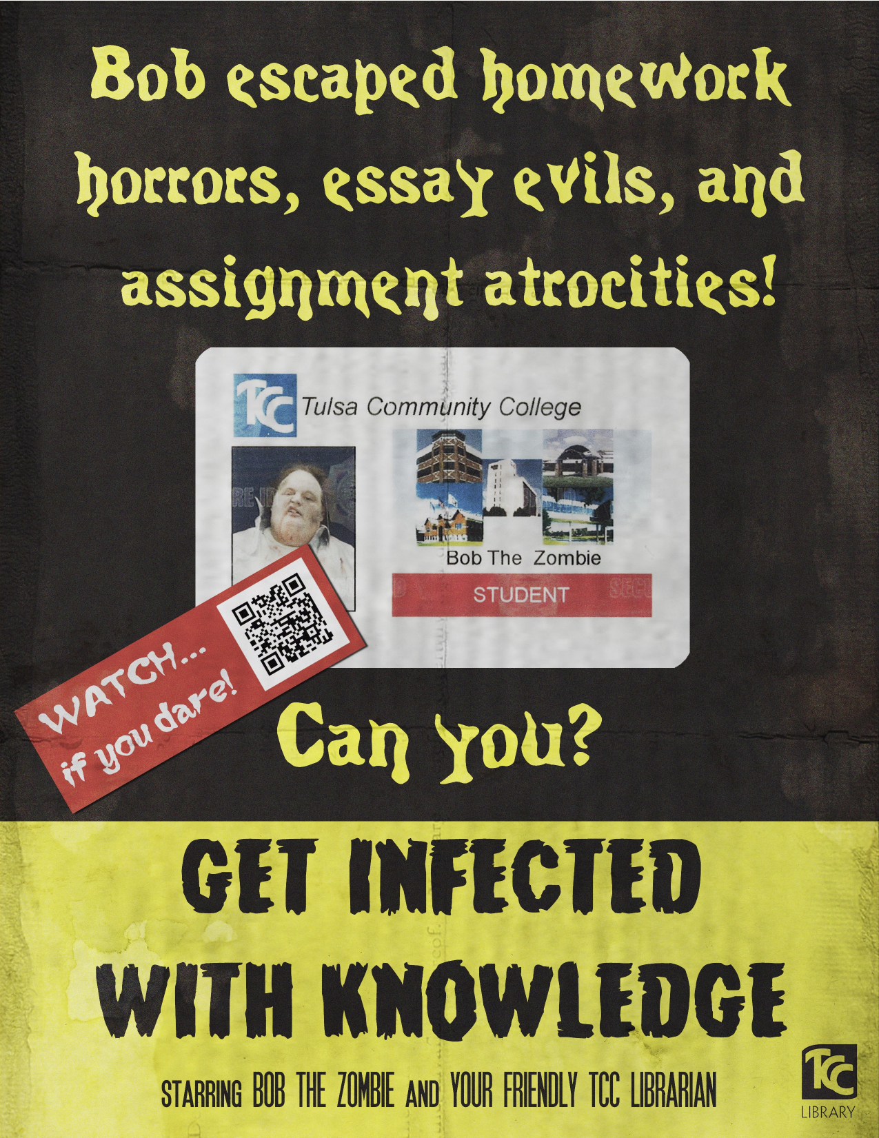
Several of my coworkers and I, along with Tulsa Community College’s video production department, recently created a zombie-themed promotional video for our library (I would be remiss if I didn’t include a link to it), and I designed the poster we’re using to advertise it.
I created the poster in Photoshop. Since our video is zombie themed, I used classic horror movie posters as inspiration for the design I created. I was able to find some tutorials online that helped me give the poster a vintage feel to it. I used textures to make the paper appear aged and creased. I also found some really great free fonts online from dafont.com. We were somehow able to convince our student activities department to make us a fake student ID for our zombie, so I used that as the main image on the poster. I am really thrilled with how the poster turned out in the end, and it was so much fun to design.
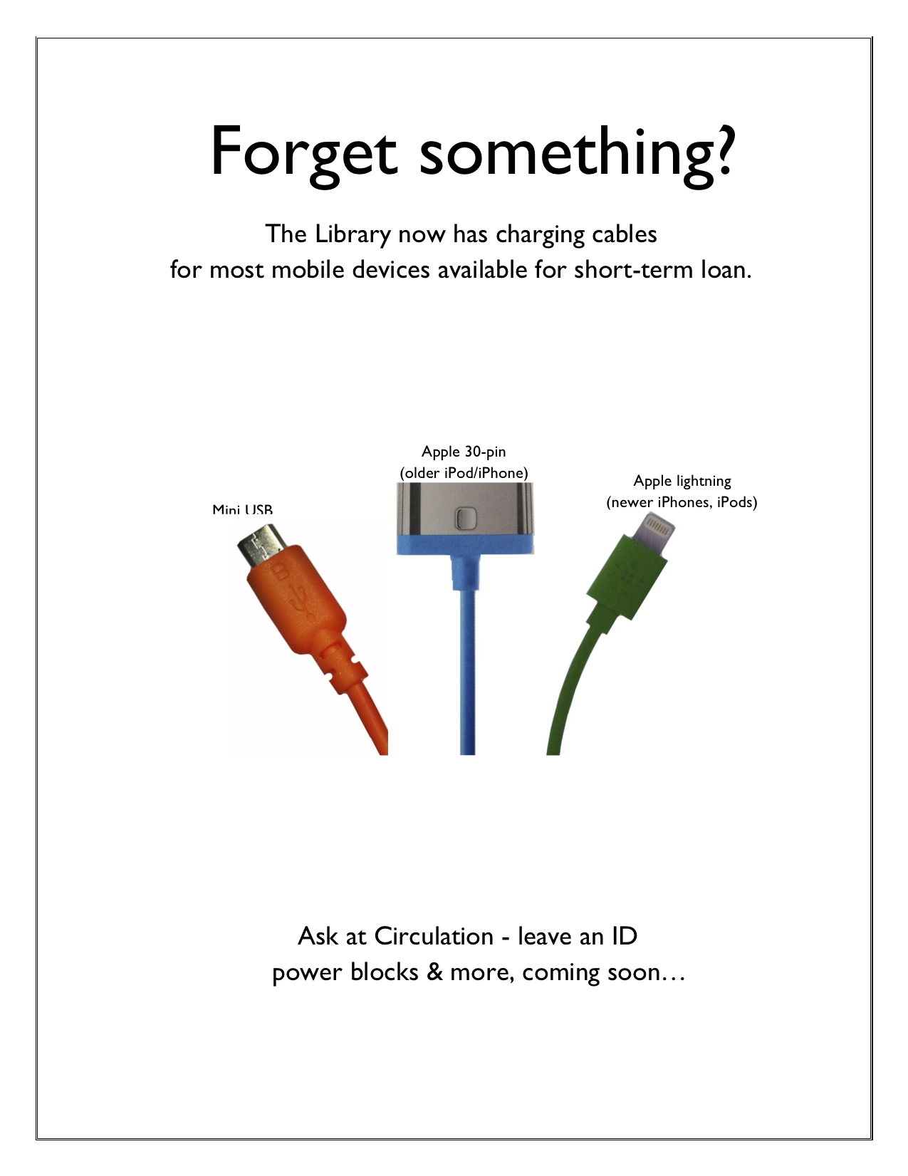
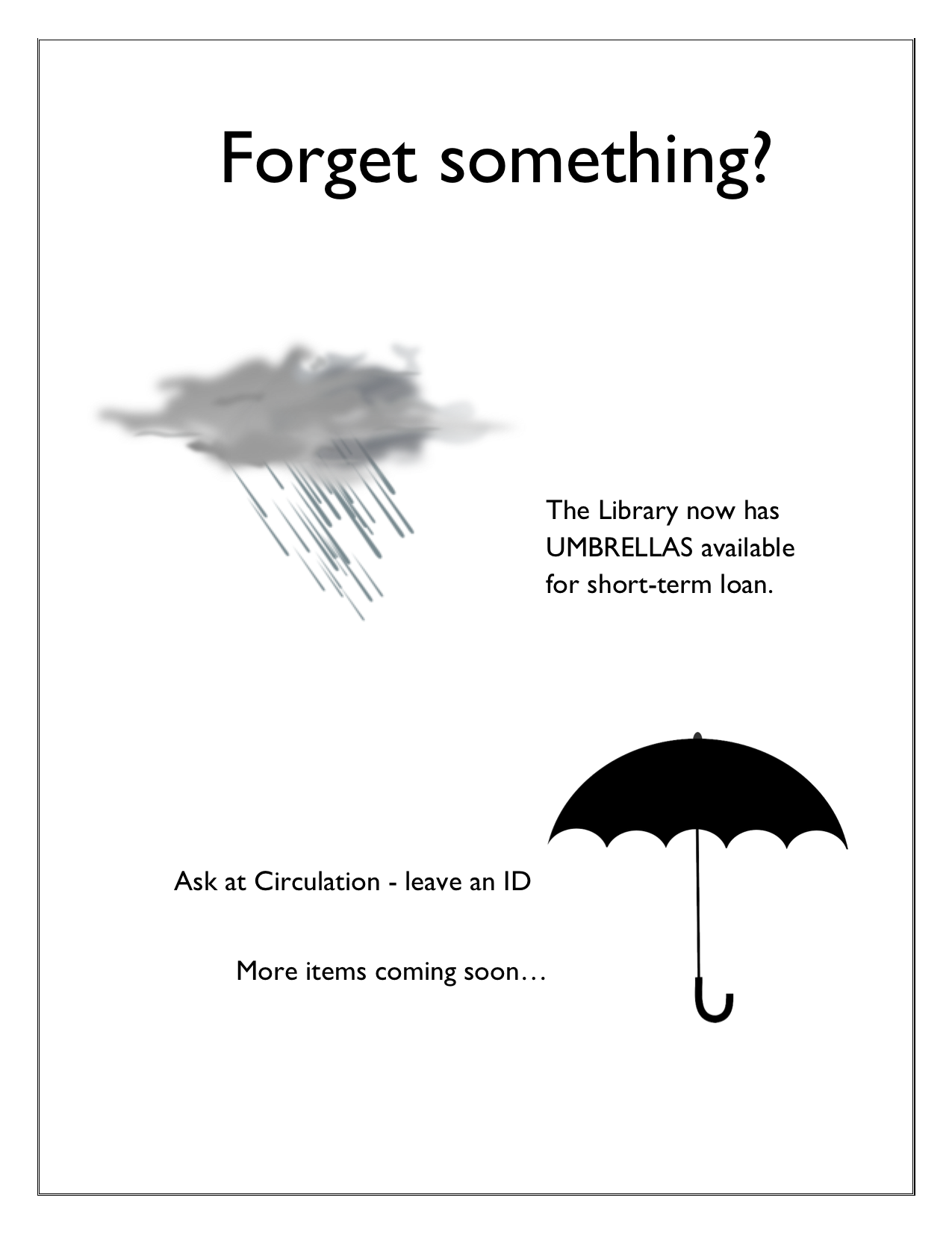
If a student has thought to ask for it, chances are it’s available to borrow at an academic library’s circulation desk. My own library loans dry erase markers, color pencils, laptop chargers, extension cords and floppy disc drives (YES, REALLY), among so many other miscellaneous items. They aren’t expensive and the students are so appreciative to borrow them when we have them.
You know that time at the beginning of a class where students are shuffling in, uncomfortably finding seats, messing with their phones, and avoiding eye contact with the instructor? I seem to have 5-10 minutes of this time at every session, and I realized that I should take advantage of this captive audience. Always thinking of ways to promote the library’s services, I made a library commercial.
It’s not nearly as fancy as it seems…I just made a PowerPoint (based on the format of this presentation) that is eye-catching, informative, and spurs some conversation beyond the awkward greeting that I extend to the students. I have the presentation scrolling as students arrive and then again as they leave. We’ve even started running the commercial at the TV near our Information Desk during the day.
I think there are lots of ways to expand on this idea. You could add sound, market different services to different patrons, turn it into web slides, make it longer or more interactive…but this is a start. If you are interested in modifying the original PowerPoint file for your own library, you can access it on Librarian Design Share’s Google Drive.
We’re always on the hunt for unique and stylish fonts for our library marketing and outreach materials. Bored with my usual go-to fonts, I started digging around online and stumbled upon two great resources: The League of Moveable Type and Typewolf.
The League of Moveable Type is a collective of typeface designers who are making amazing fonts available under SIL’s Open Font License (a group clearly after librarians’ hearts). You can use these fonts for personal, organizational or commercial designs as long as you credit the original designer. You can read their entire Manifesto online, subscribe to their newsletter, follow their blog and browse available fonts. My favorite right now is Ostrich Sans.
Typewolf, curated by Jeremiah Shoaf, is a great source of font recommendations and typeface inspiration. He links to actual uses of different fonts on the web so that you can see them in practice, which is particularly helpful if you’re trying to decide on a font to use for a virtual project.
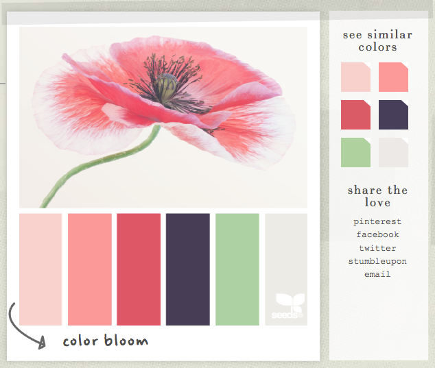
In my search for a nice color palette for a Library Instruction West slide deck, I came across the website Design Seeds via its amazing presence on Pinterest. The site is HEAVEN for anyone in search of color inspiration for a flyer, presentation, or larger outreach and marketing campaign. It’s the brainchild of designer Jessica Colaluca and I highly encourage you to check it out!