Search

Librarian Design Share

inspiration for library creatives

Category

Poster

When Design Begets Design

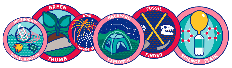
I personally love creative projects that build upon one another.  That’s one of the reasons that this poster from Jessica Richmond and Kate Transue of the Bucks County Free Library is so cool – digital designs became patches became a great poster presentation at the 2018 Pennsylvania Library Association conference.

badge squad

The library contracted a graphic designer to custom create the digital badges and the utilized The/Studio to print them on fabric.  But they weren’t done utilizing the designs!  Jessica wrote,

Our poster introduced how our library system successfully revamped an online program to create year-round in-house programs.  We already had graphics that were used to create fabric patches as incentives for the programs, so we knew these would be a focal point.  We also wanted to use one of our library’s branding colors to create a clean, consistent design, so we chose blue to complement the graphics.  Using a tri-fold layout helped us organize the information.  The center panel became the conversation starter and featured the basic concept of the programs, the graphics, and the skills & outcomes while the two side panels went into detail about the background, development, and specifics of the programming.  Instead of signing the poster with just our names and titles, we included a photo of us giving a thumbs-up next to our library’s logo.  Not everyone noticed this detail, but we definitely saw smiles from those who did!

Jessica and Kate utilized Canva to make their poster.  They described the experience as “user-friendly” and “modern.”  Jessica and Kate utilized a few Canva features to create this clean design.  The first feature they highlighted was the ability to create custom dimensions in order to fit their tri-fold display.  They also mentioned that their library has saved their branding colors as a palette within Canva and so color selection became even easier.  Jessica and Kate were happy with their Canva experience.  However they noted,

Our only complaint was the lack of a ruler and/or gridlines to see exactly where everything lined up. We did end up downloading the poster a few times and pasting it into Publisher to make sure the panels would be exactly centered. Otherwise, we were very happy with the choice to use Canva, and even happier with the result. The print itself also turned out incredibly clear because we were able to use the custom dimensions.

Kate and Jessica’s design story demonstrates the techniques that we often use to accommodate our tools or abilities.  When your design desires overcome your capabilities, it may be a good option to ask for help!  Their library’s investment in great graphic designs provided great reward.

Jessica and Kate’s design can be found on our Google drive.  Remember, all submitted work will be published on this site under a Creative Commons Attribution-NonCommercial-ShareAlike 3.0 Unported license.

News Literacy for All

I’m not really here for discussions about “fake news,” but I’m all for critical information literacy, including critical news literacy, and so are a group of librarians at Washtenaw Community College’s Bailey Library. Meghan Rose, Martha Stuit, and Amy Lee presented a poster recently at the Michigan Academic Library Association’s annual conference on their recent efforts to overhaul a News Literacy Libguide and use it as a springboard for instruction.

Continue reading “News Literacy for All”

Enhanced by Design – Presentation & Handouts

One-half of Librarian Design Share is headed to Knoxville, TN to present at the 2017 Library Collective Conference alongside Amanda VerMeulen (St. Mary’s College of Maryland) and Dan Vinson (Mount Mary University). I’m super excited to be presenting with these awesome folks, and wanted to be sure to share our presentation slides, handouts, and other resources with Librarian Design Share readers. The focus of the conference is “Make it Beautiful, Make it Useable” which was all the sell I needed to attend. The conference schedule looks amazing, and I’d encourage you to check it out.

Here’s the info about our session:

Enhanced by Design: Creating user-informed, aesthetically attractive projects for your library

In this session participants will learn how different visual materials can address user concerns uncovered through focus groups, surveys, and ethnographic studies. Products created from data gleaned through these methods aren’t inherently beautiful, but by applying aesthetic design principles to these projects we can create products where usability is enhanced by design.

What this session IS about: basic user research methods, applying basic aesthetic principles/theories to creating visual materials, design-decision making
What this session is NOT about: in-depth session on graphic design or aesthetic theory,
how to analyze user research data (no coding, no stats).

Some questions to think about before the session:
What is a problem you want to solve in your library?
What is a big picture question you have about your library/users/etc.?

You can check out our session slides below. It’s a mix of lightning style talks, discussion, activities, and Q&A. We hope the session will be interactive and fun, and we’re looking forward to learning from people who attend.

We also have a number of resources we’re sharing with participants, including:

You can also find all of the designs highlighted in this presentation on the Librarian Design Share Google Drive in the Enhanced by Design Presentation 2017 folder. If you’ll be at The Library Collective Conference too, stop by and say hello!

Donkeys and Elephants

The Presidential Debates may be done, but we didn’t want to miss the chance the share this fun event advertisement from Erica Street, Instruction/Serials Librarian at the Jenks Library at Gordon College. Focusing on one primary design, Erica was then able to modify it to suit different mediums.

Continue reading “Donkeys and Elephants”

Information Connections

As academic and school librarians gear up for the start of another school year, we’re on the lookout for different opportunities to share library resources with our campus community. Today’s post comes to us from Crystal Boyce, Sciences Librarian at the Ames Library at Illinois Wesleyan University, who is trying to reach students in labs and classrooms around her campus.

Continue reading “Information Connections”

The More Frames, The Better

Cindi Tysick, Head of Educational Services in the Research, Education and Outreach Unit of the University Libraries at the University at Buffalo used Canva to create posters to visually represent each of the frames of ACRL’s Framework for Information Literacy for Higher Education.

frameworks

Cindi reveals her sneaky trick to teach the Framework and explains why you’ll find seven, rather than six, posters in her library:

By putting these posters around your library you can begin cementing the concepts into subconscious of students and faculty.  The posters can also be printed into a brochure format, which can be given to students and faculty during orientations, workshops, or library instruction.

When looking over the posters you’ll see that there is a seventh frame, “Information has Structure.”  Our Educational Services Team at the University at Buffalo Libraries felt that there were so many knowledge practices under “Searching as Strategic Exploration,” that maybe there were actually two frames hidden there.  After debating about it we thought that students needed to know that the strategy they employed should be based on the knowledge that the information sources they were exploring had a structure (i.e. controlled vocabulary, thesaurus, browsability, etc.) so we created the seventh frame.

We are finding that this simple way to define the frames are aiding us in the development of learning objectives and lesson plans.

big-poster-framework-structure

The Framework is always a hot topic, and these posters, with their eye-catching colors, images, and icons, certainly help visualize and conceptualize something that can be confusing to faculty, student, and even librarians. You can download all seven PDF posters from the Librarian Design Share Google Drive, and you can contact Cindi with any design-related questions.


Sharing Your Research

With the ALA Annual Conference wrapping up, there are likely several librarians and library school students breathing a sigh of relief after completing a successful presentation. Super proud of your poster? Feeling like your presentation slides were on point? April and I would like to encourage you to submit your poster / slide deck designs for an ALA Conference feature post.

In the mean time, today’s post is a poster from a different conference: The Maryland-Delaware Library Association Conference in beautiful Ocean City, MD. Jenise Overmier, Instruction Librarian at American University in Washington, DC, created a great poster using a combination of Canva and Google Slides. Here’s Jenise in her own words:

Continue reading “Sharing Your Research”

It’s All in the Tone

All libraries have rules and policies; it’s how we maintain a sort of organized chaos at our dynamic, community-serving organizations. However, expressing those rules to library users can present a bit of a public relations challenge: We want to be friendly, yet firm; accommodating, but not so laissez-faire that we no longer have a purpose and mission. We often communicate our library’s policies through some sort of sign or poster, but are we thinking about the tone we are setting with the design of those posters? Our message might be saying one thing, but the way it’s visually displayed and organized may be communicating a very different meaning.

Continue reading “It’s All in the Tone”

Is that a Poem in your Pocket?

Every April the Academy of American Poets promotes Poem in Your Pocket Day, which is pretty much what it sounds like: “People celebrate by selecting a poem, carrying it with them, and sharing it with others throughout the day at schools, bookstores, libraries, parks, workplaces, and on Twitter using the hashtag #pocketpoem” (Poem in Your Pocket Day 2016). The librarians at McKillop Library at Salve Regina University have a special fondness for poetry, and use National Poem in Your Pocket Day to connect with students, faculty, and staff. Beth Blycker Koll, Evening Circulation Supervisor created this poster to promote the day and their event. Here’s Beth discussing her design:

Continue reading “Is that a Poem in your Pocket?”

Create a free website or blog at WordPress.com.

Up ↑