
I’m not really here for discussions about “fake news,” but I’m all for critical information literacy, including critical news literacy, and so are a group of librarians at Washtenaw Community College’s Bailey Library. Meghan Rose, Martha Stuit, and Amy Lee presented a poster recently at the Michigan Academic Library Association’s annual conference on their recent efforts to overhaul a News Literacy Libguide and use it as a springboard for instruction.
Did they stop at a bright, eye-catching poster with a nice layout? No way! Meghan, Amy, and Martha created a postcard and buttons for conference attendees to take home. Here’s Meghan describing their project:
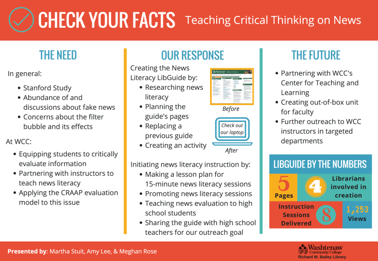
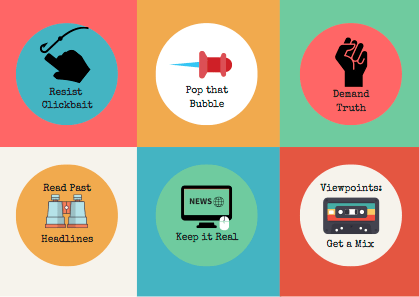
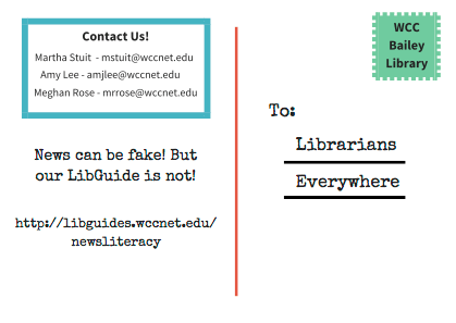
This past week my colleagues and I presented a poster at the Michigan Academic Library Association (MiALA) annual conference. Our poster outlines how we’ve used a news literacy LibGuide as a launch pad for instructional and faculty partnership opportunities. We wanted our poster to be vibrant and fun (because that’s who we are!) while also easy to understand at a glance. We’ve also been on a bit of a button-making craze since reading your “So Many Buttons” post inspired us to purchase a 1” button maker. We made six button designs with a news literacy theme for participants to collect, take home, and remember us by. To round everything out and give people another takeaway, we designed a postcard with our contact information, a link to our LibGuide, and a snappy little tagline.
Canva was the platform of choice for all of our designs, not only because it is easy to use and full of beautiful templates, fonts, and illustrations, but because it allowed us to collaborate on our designs asynchronously and remotely. We love Canva! It’s one of the sharpest tools in our belt.


Here are some takeaways from our experience:
- Keep poster clean and uncluttered and only highlight the most important details. This allows people to get the gist of your project or idea at a glance. People can ask questions, read a handout, or visit your project website if they want to take a deeper dive.
- Keep the theme consistent between your poster, handouts, and any other takeaways (ahem, buttons) you might have. Color scheme, fonts, images and the “personality” of the presentation should be connected across all of your presentation materials.
- Have fun! Who says academic presentations require toned down colors and a lack of puns. Let your creativity and sense of humor mingle with pedagogy, scholarship, and methods.
These wonderful buttons, postcards, and the amazing poster are all available on the Librarian Design Share Google Drive.

Leave a comment