Search

Librarian Design Share

inspiration for library creatives

Month

June 2014

Librarian Design Share at ALA

Going to Las Vegas for ALA Annual Conference? We are too! April and I will be presenting a poster about our work on Library Design Share on Saturday, June 28 from 12:30 – 2:00 pm in the Conference Center Exhibit Hall, poster station #17. Stop by, say hi and watch us try to color-coordinate our outfits to our poster!

If you aren’t able to come to Vegas, take a look at our poster below. If you want to reuse any design elements from the poster let us know in the comments section or send us an email.


Librarian Design Share ALA 2014 Poster

Now In Concert: Advertising Events in the Library

One of the challenges of advertising library events on college campuses is the non-stop barrage of publicity emails, flyers, posters, and announcements that fly around campus. Whether it’s the ultimate frisbee team’s bake sale fundraiser or the theater department’s latest dance performance, somewhere on campus someone is holding an event. The preponderance of “stuff” going on increases the need for targeted, engaging and attractive advertising for library events.

This is where our latest submission comes in.

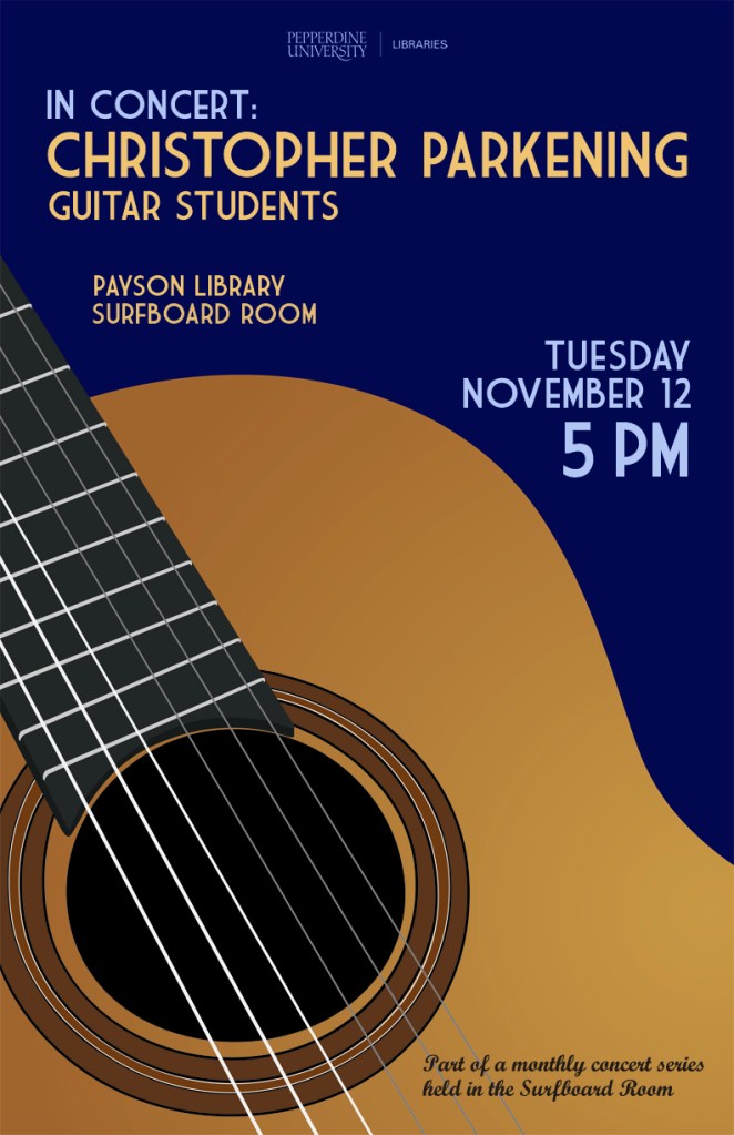
Brandon Scheirman, Marketing and Graphic Arts Associate at the Pepperdine University Libraries, created a series of posters using Adobe Illustrator advertising a guitar students’ concert, a part of a monthly concert series held at the library.

Guitar Series Poster Blue

My library holds a monthly classical guitar concert in one of its rooms and my job was to create a series of posters that advertised these concerts in a clear and classy manner. I wanted to go for a little bit of a retro feel that brought color and bold images to the library, which is something that the library has struggled with. These posters have been widely recognized across campus and brought the events together as a cohesive series.


Guitar Series Poster Green

Brandon’s posters are a beautiful example of unifying different designs through the repetition of common elements. In this case, he maintains consistent use of typography and imagery by repeating the same font in different colors as well as the same guitar from different angles. The library logo remains unobtrusive but still present, letting the fantastic, bold poster design shine through.

Guitar Series Poster RedIf you’re interested in learning more about how these posters were created or obtaining a copy of the Illustrator files, please email Brandon Scheirman.

Visualizing Research is Hard

I’ve been working on a poster for my institution’s ACRL Assessment in Action project for the past month or so and it’s easily been one one of the toughest things I’ve had to design EVER. With ALA and other summer conferences around the corner, I’m willing to bet there are plenty of librarians and library students in epic-poster-design-battle-mode at the moment. So let’s talk posters, research and pictures.

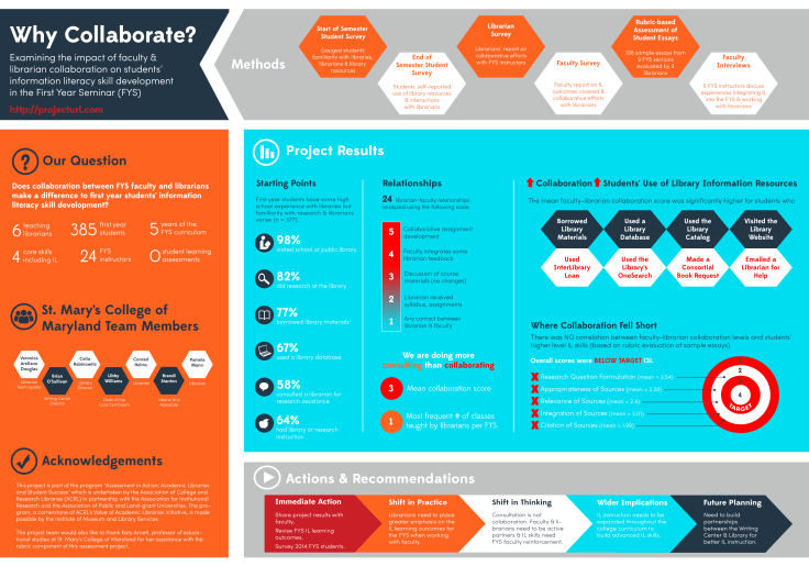
To sum up our AiA Project: The St. Mary’s College of Maryland team was interested in learning if faculty-librarian collaboration had an impact on students’ information literacy (IL) skill development in the First Year Seminar (FYS: a required course for all first year students). It was a multi-method assessment: student surveys, faculty surveys, librarian surveys, rubric-based assessment of student essays and faculty interviews. This made coming up with a poster design particularly challenging since there was simply SO MUCH INFORMATION to share.

After hearing from an AiA cohort member who was taking a really simple, conversational approach to designing her project poster, I knew that I wanted to try to replicate that approach as much as possible. There is only so much information you can take in from a poster, and I would much rather be talking to people about different aspects of my project than having them squinting at the text above my shoulder.
AiA-Poster-Draft-small

I still think the poster is kind of busy, but to be honest, I’m so tired of it right now that I’m willing to let it go through the AiA peer review process and worry about it next week. It still needs alignment adjustments, and I’m not totally sold on the white font on the blue background, but it’s something!

Here are the pieces I like best:

Methods: All of our assessment pieces were part of a greater whole, and took place at various points throughout the semester. I was inspired by other AiA colleagues who took a timeline approach to their methods section and thought this was a nice compromise.

methods

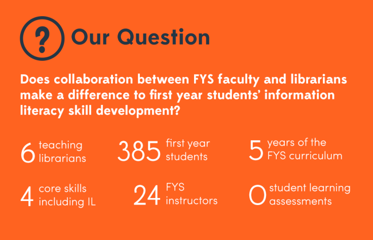
Research Question & Background: This was originally a long paragraph with background information about our First Year Seminar, our IL outcomes, and our assessment project. I decided that if someone really wanted the long story, they could visit our project website (which I’m in the process of developing) or just ask me more about it. I paired down the research description to the just the essential question and basic facts about the FYS and our involvement with it.
question

Results: This is just a portion of the results section, which was easily the most difficult section to develop. I’m still not totally pleased with it, but I wanted to try something other than bullet points and graphs. I don’t know if I did the right thing leaving out numbers and I may go back and change that, but again, I think if people want the finer details I can refer them to the project website with averages, t-test scores and correlation scores, right (I hope)?

results

What kind of posters are you working on for conferences this summer? What’s your approach to visualizing your research?



Let Us Know

Assessment isn’t easy, and sometimes the hardest part of measuring your effectiveness is getting patrons to take a survey.  When our library embarked on the LibQual survey last month, we had a goal to reach more patrons that we had in 2010.  We agreed that a marketing campaign was the best way to accomplish this, and that our catch-phrase would be “Let Us Know,” which is simple, but exactly what we wanted patrons to do.  So I got busy making designs to promote our LibQual.

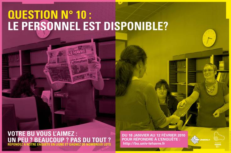
Whenever I start to create something, I look for other examples out there for inspiration.  I found these amazing designs from a French library (and then of course I had to Google translate to understand the text!):

Affiche2Libqal+40X60cm

Affiche3Libqal+40X60cm

These marketing signs were unlike any others I had seen, and I knew I wanted to create something similar for our library.  In the designs above, you are asked if you prefer your library one way or another…I didn’t have a lot of staff to stage pictures, so I used the pictures we already have.  My designs don’t compare services, but each one does ask a question straight from the LibQual survey.

libq1

libq2

I placed eight different variations of this design around the library to catch patrons’ eyes, but to remain consistent in design and message.  I furthered our library “brand” by using orange, the color we use on our handouts, website, and instructional materials.  Our patrons are pretty used to seeing “library orange” these days.  To continue the message, we used the phrase, “Let Us Know” with an orange picture in emails to faculty, staff, and students, and we placed this banner on our website:

news_banner10

So how did it go?  Well, we increased our respondent rate by 25% from years past.  We can’t directly count the marketing for the increase, but I’d say it didn’t hurt.

What are you doing to promote your library?  Have you tried to market your LibQual survey?  Share your designs here with us!  And, if you would like the original Publisher documents to modify for your library, contact me.

Create a free website or blog at WordPress.com.

Up ↑

%d bloggers like this: