
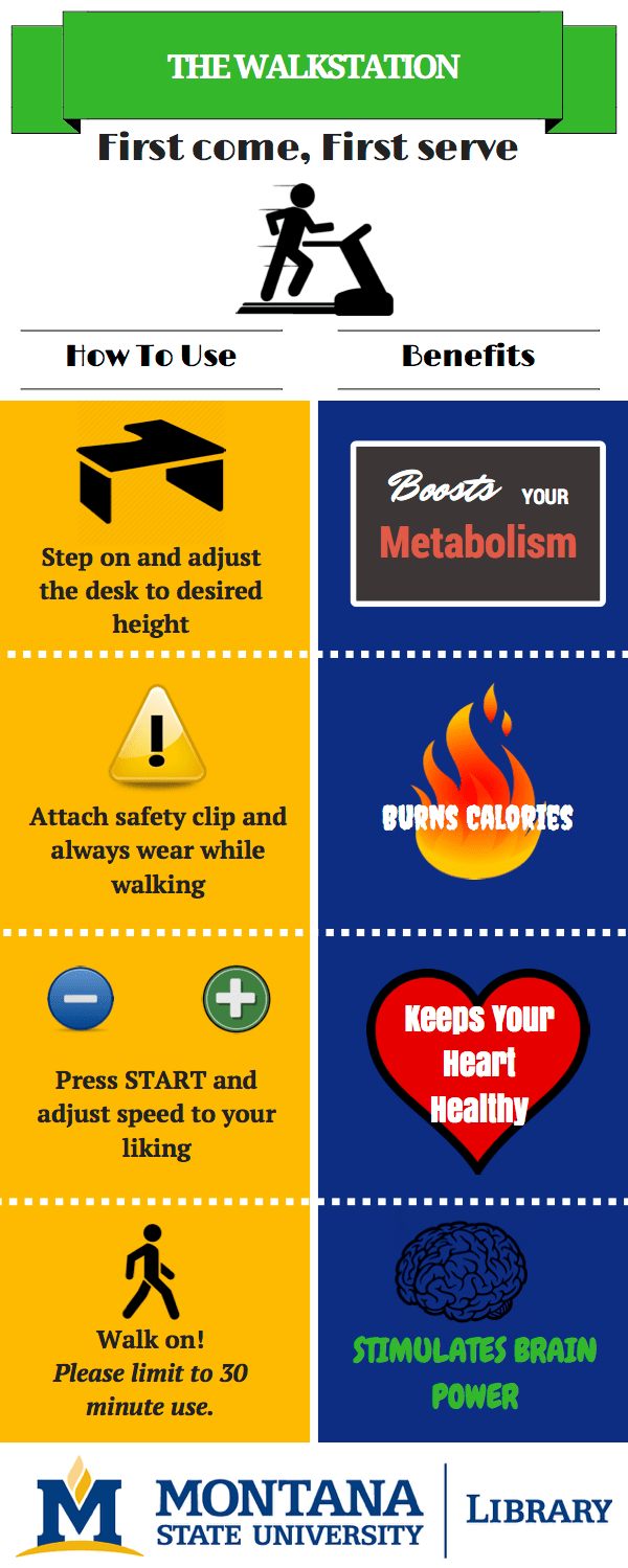
Today’s post is a little different in that we’re not just sharing a finished design, but showing and describing a design revision. This submission comes to us from Brittany Iverson, Learning & Research Services Librarian at Montana State University. A walkstation was recently added to the Library Commons, and Brittany was asked to create an infographic with how-to-use instructions and the benefits of walking while working. Here is the first draft of her work:
DRAFT 1
But as all us working on graphic designs in libraries know, the first draft of something is never the final draft. Here’s Brittany describing the revision:
Taylor Schultz, my coworker, and I worked on the redesign together. Originally, she had told me her idea for this project, what her goals were, and asked that I create the first draft.
She wanted it to include basic courtesy (first come, first serve; please limit to 30 min a session, etc), how to for the machine (basic steps), health benefits of walking, and mental/study benefits of moving while you work.
When her and I sat down to work on the second draft together, I realized that with all the benefits I’d previously listed, there was no space for the instructions. After getting some feedback from our boss, we added 4 quick steps along with 4 health benefits, and changed the color scheme to match our University colors.
This infographic lives in front of the machine, so people don’t have to read through a detailed instruction manual to know how to use it.
DRAFT 2:
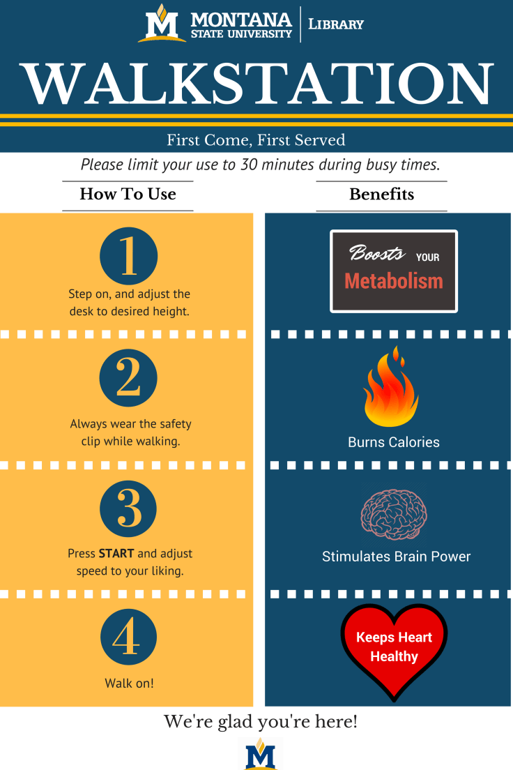
I think the consistent font and clean design of the second draft really showcases the ease of use of the machine as well as the amazing health benefits of walking. Now I just want a few of these for our library, too.

February 15, 2017 at 11:28 am
I want one for me at work! 🙂 I like the revision.
February 16, 2017 at 10:30 am
Me too!