Search

Librarian Design Share

inspiration for library creatives

Author

April Aultman Becker

Honey Badger vs. Grumpy Cat

We live in a world of fickle and fast preferences.  Virginia Alexander, a Reference Librarian at The University of South Carolina Upstate, had previously used the honey badger meme featured here on Librarian Design Share to teach her classes Boolean logic, but recently found that her students either didn’t recognize the badger, or had tired of it. So, Virginia gave the meme an update using pictures from Creative Commons and Microsoft Publisher and Canva.com:

booleancats (1)


Here’s just hoping her students don’t say this next…

If Honey badger Don't Care You Think I Should? - If Honey badger Don't Care You Think I Should?  Grumpy Cat

image 

If you want to adapt Virginia’s Grumpy Cat meme to use at your own institution, contact her for the original files, or find them here in Librarian Design Share’s Google Drive.  If you do alter this meme, consider submitting to us…we can make this a recurring post!

Holiday Hours

Like many libraries out there, my library has reduced hours during the holidays.  This creates quite a bit of confusion for patrons, and it’s compounded when our signage looks like this:

hours before

Sure, all the information you need is right there, but it’s so hard to read.  I made this schedule to hang outside the library, and after printing it, I realized how bad it was. I took the same information and rearranged it into a calendar format:

hours after

Way better, right?  It’s so much clearer when we’re open and when we close early.  The color and graphics make the sign just a bit friendlier too.  It literally took 5 additional minutes to insert a table into Publisher and find the snowflake clip art than it did to make the block of text from the first sign.  I’d say it’s worth the effort!

We’d love to see examples of revised signage you all have tackled.  Submit your designs here!

Happy Medical Librarians Month (a little late)

October was National Medical Librarians month.  I realize that’s in the rear-view mirror now, but still wanted to share what we did to celebrate in my library this year.

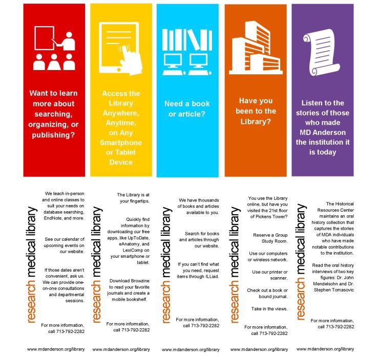
I was inspired by a trip that Veronica and I took to the local Portland library while we were there for a conference.  The Multnomah County Library had a great display on their counter of colorful business cards with simple, effective icons and messages like the one below (I know, I should have collected them all!):

cardfront

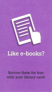
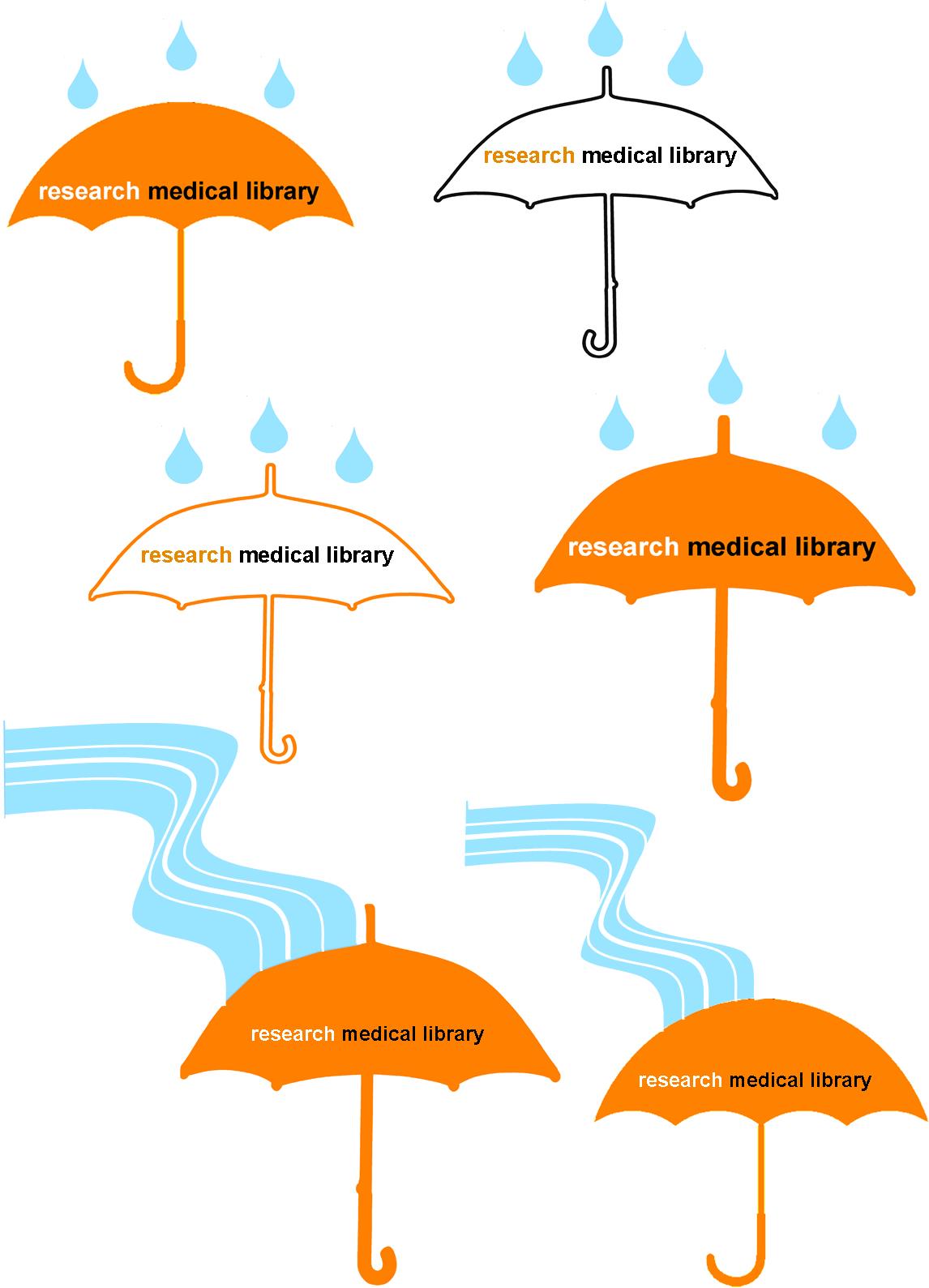
I liked the idea that patrons could easily pick up the card to learn more about and learn more about the library’s services.  I wanted to implement this somehow at my own library. After brainstorming with staff, we decided to use the five weeks of October, which is National Medical Librarians Month, to celebrate our services. However, with our limited resources (read: me printing on cardstock on the staff machine and then using the paper cutter), we decided to make our takeaways just a bit bigger into the shape of bookmarks that we already are used to cutting and displaying.

Below are the five features we decided to highlight and the Publisher bookmarks (fronts on the top row and backs on the bottom) that I created:

bkmks

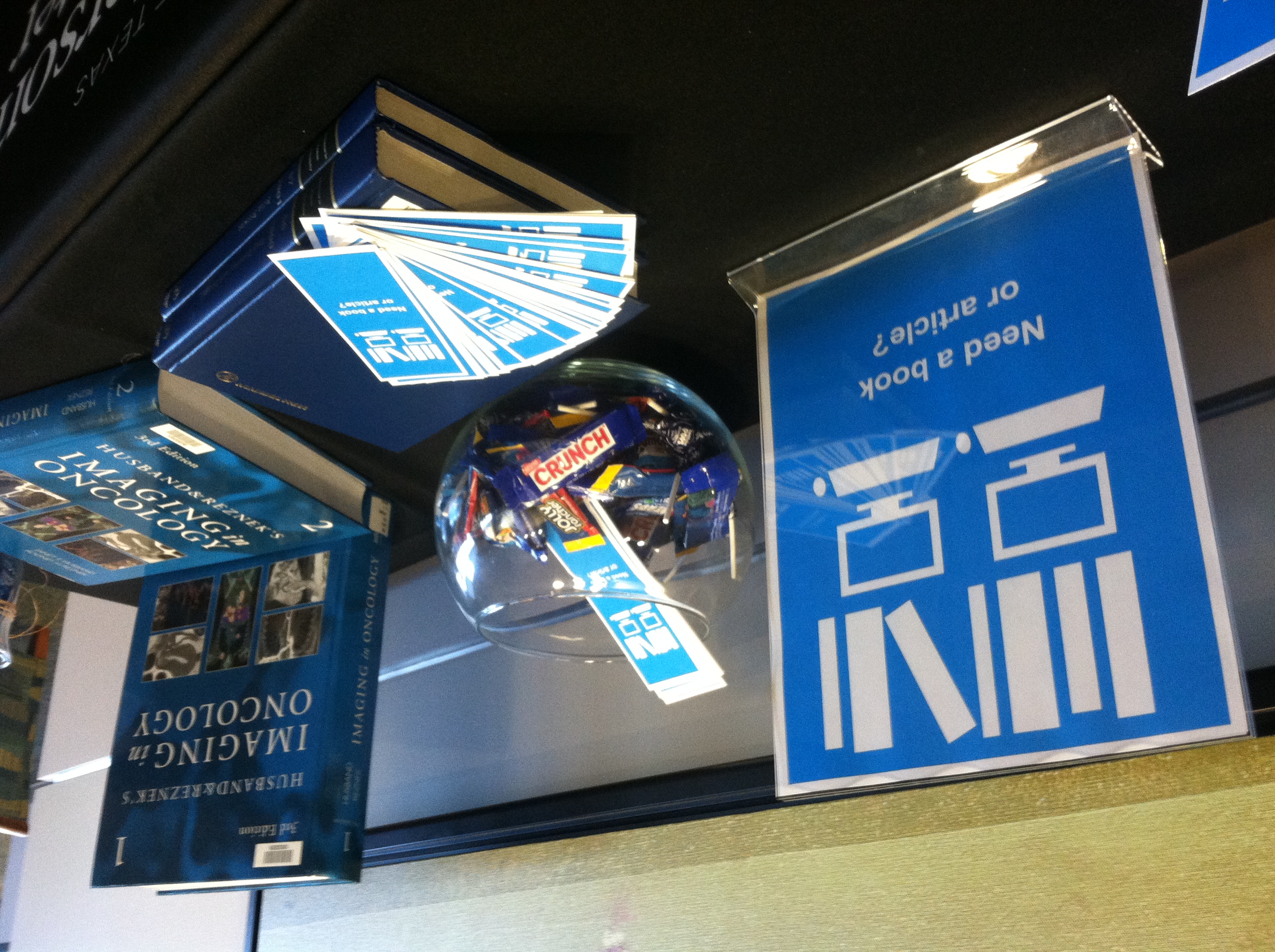
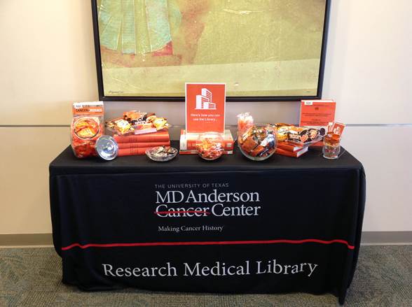
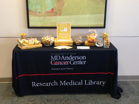
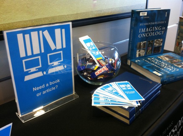
We were happy with the candy-colored printed bookmarks and thought that it would be really cool if these giveaways could coordinate with colors of REAL candy.  This involved a carefully planned trip to the grocery (thank goodness it was near Halloween with lots of candies to choose from), and some masterful exhibit making involving colored books, journals, and all the containers we could find in the library.  Here’s how it turned out week-by-week…please excuse the amateur photography:

Our library as a physical space:

orange


Our mobile resources:

IMG_1111

Our collections:

b1photo

Our educational offerings:

rml

Our archives:

photo purple2


Our patrons loved the changing displays and anticipated the colors, candies, and services they would see the next week.  Of course, more than anything, they liked the candy, but lots of good conversations were sparked in the month of October.

Do you celebrate months or certain days in your library?  We’d love to see your pics and materials if you do!  If you would like a PDF or the original Publisher document for the bookmarks, you can download them for adaption from the Librarian Design Share Google Drive.

No Original Ideas

I’m pretty sure that there are no original ideas out there anymore.  I regularly apply this philosophy to designs I create.  When I start a new project, I find something that is inspiring, and then try to adapt the design (maybe just the colors, or shapes, or fonts) to my needs.  For example, I recently ran across the Scopus blog while preparing a presentation about the H-Index.

01-scopus-blog

I found the header of the blog to be modern and beautiful, and I wanted to try to recreate it.  However, with limited time, I couldn’t pull it off (you know, I had to focus on the content more than the design). Instead, I used my Colorzilla tool to capture the colors and I used the idea of the circles and connecting lines to illustrate the concept of “H-Index and Beyond,” as you can see below.  To further the modern feel of the presentation, I used the font, Multicolore, which you can download here (and here’s a little trick that Veronica just taught me about SlideShare: to avoid losing your non-standard fonts, save your document as a PDF before uploading to the site!).

I wouldn’t say that this is the best presentation I’ve ever created, and I still regret not being able to create the window-paned orbits like Scopus made, but I feel like it borrows from the original design without plagiarizing it.

You can find the original file here to download on the Librarian Design Share Google Drive Folder.  Feel free to modify the PowerPoint for your own use, and if you create something cool, let us know!  We love to feature updates of designs here on the blog.

Vintage-Modern Message

Paseo Verde Library in Nevada has the same problem that many libraries do: patrons who loudly carry on phone conversations without regard for those around them.  Instead of shushing or putting up passive-aggressive signage that no one reads, Virtual Branch Librarian Tawnya Shaw designed something that clearly conveys the message with an image that might just cause patrons to do a double-take:

No-Cell-Sign2

To create this eye-catching design, Tawnya used Photoshop to alter a piece of Victorian clip art and Rockwell font for the text.  The combination of image, font, and white space make this vintage design somehow feel very modern and effective.

Want to get the message out at your library?  You can download the original files from the Librarian Design Share Google Drive Folder and modify as you wish.

Commercial Appeal

You know that time at the beginning of a class where students are shuffling in, uncomfortably finding seats, messing with their phones, and avoiding eye contact with the instructor? I seem to have 5-10 minutes of this time at every session, and I realized that I should take advantage of this captive audience.  Always thinking of ways to promote the library’s services, I made a library commercial.

It’s not nearly as fancy as it seems…I just made a PowerPoint (based on the format of this presentation) that is eye-catching, informative, and spurs some conversation beyond the awkward greeting that I extend to the students.  I have the presentation scrolling as students arrive and then again as they leave.  We’ve even started running the commercial at the TV near our Information Desk during the day.

I think there are lots of ways to expand on this idea.  You could add sound, market different services to different patrons, turn it into web slides, make it longer or more interactive…but this is a start.  If you are interested in modifying the original PowerPoint file for your own library, you can access it on Librarian Design Share’s Google Drive.


Let Us Know

Assessment isn’t easy, and sometimes the hardest part of measuring your effectiveness is getting patrons to take a survey.  When our library embarked on the LibQual survey last month, we had a goal to reach more patrons that we had in 2010.  We agreed that a marketing campaign was the best way to accomplish this, and that our catch-phrase would be “Let Us Know,” which is simple, but exactly what we wanted patrons to do.  So I got busy making designs to promote our LibQual.

Whenever I start to create something, I look for other examples out there for inspiration.  I found these amazing designs from a French library (and then of course I had to Google translate to understand the text!):

Affiche2Libqal+40X60cm

Affiche3Libqal+40X60cm

These marketing signs were unlike any others I had seen, and I knew I wanted to create something similar for our library.  In the designs above, you are asked if you prefer your library one way or another…I didn’t have a lot of staff to stage pictures, so I used the pictures we already have.  My designs don’t compare services, but each one does ask a question straight from the LibQual survey.

libq1

libq2

I placed eight different variations of this design around the library to catch patrons’ eyes, but to remain consistent in design and message.  I furthered our library “brand” by using orange, the color we use on our handouts, website, and instructional materials.  Our patrons are pretty used to seeing “library orange” these days.  To continue the message, we used the phrase, “Let Us Know” with an orange picture in emails to faculty, staff, and students, and we placed this banner on our website:

news_banner10

So how did it go?  Well, we increased our respondent rate by 25% from years past.  We can’t directly count the marketing for the increase, but I’d say it didn’t hurt.

What are you doing to promote your library?  Have you tried to market your LibQual survey?  Share your designs here with us!  And, if you would like the original Publisher documents to modify for your library, contact me.

A Breath of Fresh Air

We recently had some changes in our library, which precipitated a change in the General Info sheet that we have on our desk.  Originally, I was just going to update the information, but it seemed like a good time to mix up the design too, as we haven’t in over two years.

Here’s the old design, heavy with institutional colors, a traditional image, and lots of text:

3-4-2014 8-29-09 AM

And here’s the newer version with lots of white space and an image of our library that better represents our focus here (i.e., not solely books or even the physical world):

Picture1

So, yes, most of the text is still present, but I feel like it has more room to “breathe” with more white space.  I’ve retained our brand and color scheme, but simplified the design, and I’m a lot happier with the look.

Do you periodically update the look of publications in your library?  If you’ve done any of this lately, we’d love to see some before and afters!

If you are interested in the MS Publisher version of this design, contact April.

Flood of Information

Sometimes when bad things happen, you brush them under the rug and pretend they never happened. Other times, you have to address them, embrace them, and then celebrate them. I’m so happy that our library did the latter after our leak last year. We were lucky to have the institution’s full support to repair our space. Once we did that, we decided to throw a party to recognize those who helped us and to welcome back our patrons.

rmlcelebrate

When designing the invitations (above) for our celebration, our library felt that it was important to keep the theme very similar to that of the leak communications. As a group, we brainstormed ideas that would go with the droplet, and we came up with the idea of using an umbrella. It’s a protection device, and that’s what our role was during the leak–protecting both our collection and our patrons from harm. I presented the following designs to the library to vote on:

umbrellas

I used clipart umbrellas from Microsoft Word, filling some with colors and changing the outline colors.  I combined the umbrella image with multiple clipart rain droplets that I previously used.  This design was OK, but it felt like the library had endured more of a flood than just a few drops of water…so I used the curvy line drawing feature in Publisher to insert a “flood” that runs to the umbrella.  Our staff overwhelmingly voted for the flood rather than the drops, and they liked the simpler umbrella best, so we had an icon for our party invitation and publicity efforts.

This design opened a floodgate of ideas (sorry for the pun, but get ready for a lot more to come!).  We decided our party would include a self-guided “Flood of Information” tour, which would highlight the different spots in the library that were affected, as well as connect those spots to a fact about our services.  Each station, named after songs that we thought exemplified the experience, was an exhibit: we had a tape line that showed how far the water flooded; we displayed damaged books; we had pictures and videos from the leak; and we showed a video about disaster recovery.  The five stations were easily found with a map that was coordinated to blue paper droplets taped to the floor.  Below is the two-sided map we distributed to our guests (and I won’t even go into the boring details of making the map, although it probably took longer than any other part of the design!).

floodofinfotour

To make our party even more personalized, after the tour, we invited guests to enjoy homemade cookies that all of us on staff had baked.  It was a warm welcome back for our patrons and a real celebration of our successful recovery.

If you are interested in any of the designs above to modify for your own recovery or celebration, let me know.

Create a free website or blog at WordPress.com.

Up ↑