Last December I shared a sign I created for our reference desk advertising our library’s chat reference service and LibAnswers Knowledgebase. I love it when designs on our site get remixed and re-purposed. Erica DeFrain of Honey-Badger-Boolean fame switched up the sign’s layout, “fussed with the text,” and of course, changed colors to match her home institution. The result is below:
Awesome, Erica! If you’ve adapted any of the designs on our blog, let us know! We’d love to feature them here.
If your library is anything like every library I’ve ever worked in or visited, you have at least one hastily created 8.5″ x 11″ flyer meant to disseminate some bit of library policy or rule. More often than not there are collection of these flyers in mis-matched fonts and color schemes across the library, devoid of any branding or cohesive theme, and let’s be honest, just plain UGLY. My library has ’em. Your library has ’em. We all have at least one example of a sign we pass on a daily basis that just makes us cringe.
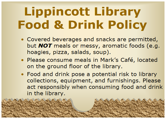
I’ve become the unofficial designer here at my library. I’ve had no official design training other than attending workshops on several Adobe products. I’ve been trying to update some of our outdated signage around the library. One of the signs we’ve had for a long time is the Food & Drink Policy. The old sign is so full of text that I am sure no one is reading it! I designed a new one that is more visual.
We have small plastic sign holders that are 5×7, so I made my sign so that it can be printed, then folded in half. I try to save prep time in the design.
For the original Adobe Illustrator file of this design, please email Melinda Roberts.
Instruction librarians are no strangers to explaining Boolean operators. The trick is to never mention the words “Boolean operators” to students, lest their eyes begin to glaze over and drool begin trickling from the corners of their slightly open jaws. So we try everything we can to make it entertaining, from sit down/stand up exercises (e.g. “everyone wearing blue jeans AND glasses stay standing”) to amazingly hilarious images like the one above, created by Erica DeFrain from the Bailey/Howe Library at the University of Vermont.
I’m actually married to a graphic designer…but I think (I hope) the ugliness contributes to the humor of the whole thing. Talking about Boolean search logic can be a little challenging, especially in late-afternoon classes. I wanted to give a nod to a cultural phenomenon while also perhaps getting a laugh from those in the audience who know and love the infamous honey badger.
We recently moved our entire DVD collection out to the open stacks in our library. They used to be behind the circulation desk, and anyone who wanted to check out a movie had to look up a title and request it or browse through pages and pages of our DVD listings in a printed binder.
To celebrate our new browsable DVD collection, we toyed around with featuring librarian and library staff movie recommendations on the tops of the shelves and via social media. I came up with the posters below. They’re my less creative, i-can’t-use-illustrator-so-photoshop-will-suffice versions of these minimalist children’s book covers and re-imagined movie posters. I also threw in an advertisement for our library’s new Films on Demand Subscription, to go along with our movie emphasis.
I didn’t get a chance to brand the posters for our library, and ultimately, our library decided to go in a different direction with the publicity efforts. Even though these posters didn’t get used I thought they were still worth sharing in the event that someone else might use them or be inspired to great better versions!
Whether we want to admit it or not, it’s quite likely that we all have a map in our library that looks a little something like this:
The “Before” — Original St. Francis College Library Map
It’s descriptive, but difficult to scan, confusing to read, and not particularly visitor-friendly. Carolyn Li-Madeo at the St. Francis College Library in Brooklyn, NY took this original library map and turned it into a resource that’s not only easier for students and visitors to use, but clearly maps out the important spaces in her college library.
New St. Francis College Library Map — FrontNew St. Francis College Library Map — Back
Here’s Carolyn in her own words:
The library map is one of my most used tools at the Reference Desk. Prospective students and their families take copies as they pass through on tour, students and professors utilizing the library from other schools use it to find their way around, freshman locate quiet spaces to study and almost every student who comes to the desk for a Reference Interview leaves with an annotated library map.
It was from these scrawled map notes — full of highlighter, arrows and call numbers — that I began to rethink how the map could better serve library patrons. So much of what the library has to offer students and professors is hidden behind a necessary veil of organization, however this organization tends to lead to an obstructive curtain of abstraction.
My goals with the redesign of the map was to ‘un-code’ the library collection by creating visual and textual entrance points for users. This primarily entailed adding subject headings by call number to the new map key and also the creation of a color coding system. You might notice that the subject headings are not all Library of Congress subject headings, instead some of the headings were changed to reflect the courses of study available at St. Francis. Additionally, many students study both nutrition (health promotion) and sports medicine, so these two divided sections were visually connected by the same color.
Other simplifications included the removal of ephemeral or highly detailed information that did not pertain to the physical collection. Individual tables (which often move throughout the semester) as well as computers were eliminated from the map.
Additionally, locations where students can receive help or assistance were united using icons and all three floors of the library were rotated to face north. This rotation caused the map to spill off onto the back of the page, a happy accident that allowed for a space to answer some frequently asked questions regarding library policy.
You can read more about Carolyn’s map redesign on her fantastic blog, Antelope as Document. You can download a PDF of her redesigned map, or email Carolyn for the original Adobe Illustrator files.
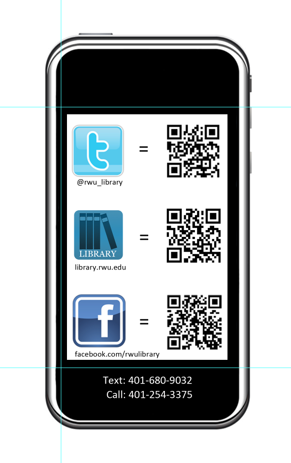
If you’re an academic librarian, late summer is (among other things) the time for Fall Semester prep. Lindsey Gumb, Web & Digital Services Specialist at Roger Williams University Library has created these cute bookmarks to give away to freshman and new students in the fall. Here’s Lindsey in her own words:
I recently designed a “bookmark” to be passed out to incoming freshmen to promote our social media and to give them a quick “cheat sheet” link to all the ways to connect with us. We’re new to really using social media to connect with our students, so we want to make sure we promote as much as we can. This bookmark is just one way we’re doing that! It was designed using Photoshop CS5, and I have the psd files for anyone that’s interested in seeing them. I’m not a graphic designer by any means, so the design is simple, but it works for us, and I’m happy to share!
Like a lot of libraries, the St. Mary’s College of Maryland Library has a blog. The librarians (and some of our library staff) are rotating contributors, and we try to cover everything from interesting stuff in our print and online collections to events to what’s going on in the info-verse. It’s a mixed bag, but we like it that way.
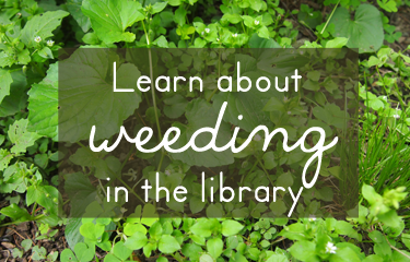
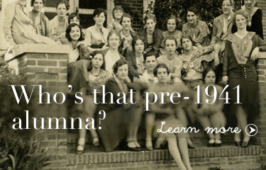
Although we offer plenty of ways for our campus community to subscribe to content updates (Twitter, RSS, Email), I haven’t been super successful at increasing our number of subscribers. So to make sure that people know about our blog, I try to highlight our posts on our library website’s image carousel. Here are my latest efforts:
Photo Credit: Chickweed forest by Wayne Marshall on Flickr.Photo Credit: Image by SMCM Librarian Alana VerminskiPhoto Credit: Image from the St. Mary’s Library Archives
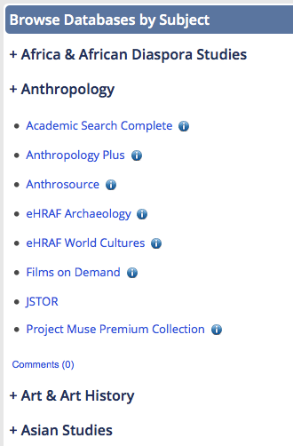
Although we’ve embraced Libguides as a platform for creating subject (and not-so-subject-based) guides, we hadn’t really been using Libguides in a way that many librarians currently do: as the main access point to the library’s online database collection. Instead we were using ResearchPort, a gateway maintained by the University of Maryland Libraries ITD center. We wanted to have more control over our database access point interface, so we decided to go with a Libguide. Here’s what I came up with: Databases Libguide (see screenshots below).
It has the same look and feel as our library site and our other libguides, but has some cool features I’m really proud of creating and adapting.
1. A drop-down Databases by Subject menu
The technical support at Springshare is amazing. I knew that I wanted to avoid creating separate pages/tabs for each of our subject categories, but I didn’t know enough about scripting to create collapsible menus. Enter Cindi Trainor at Springshare, who set up a great collapsible box feature for me to use. All that was left for me to do was style each of the subject boxes that that they smooshed together (yes, that’s a technical term) and looked like one giant box. Fooled you, didn’t I?I think this is a nice way to get a lot of useful content on the page without taking up a ton of room. Bonus: Our subject librarians can reuse these database boxes on their own subject guides!
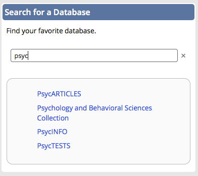
You can learn more about this search box in the Libguide Scott created for his presentation. It’s a great alternative to using the “search this guide” feature embedded in Libguides, which will only give you the name (aka the letter) of the page in which the database link appears.
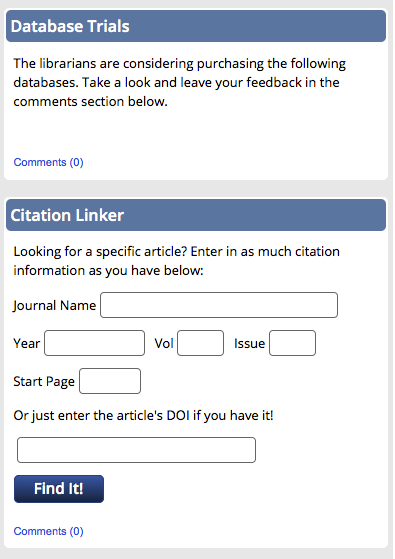
3. A space for database trials and our citation linker
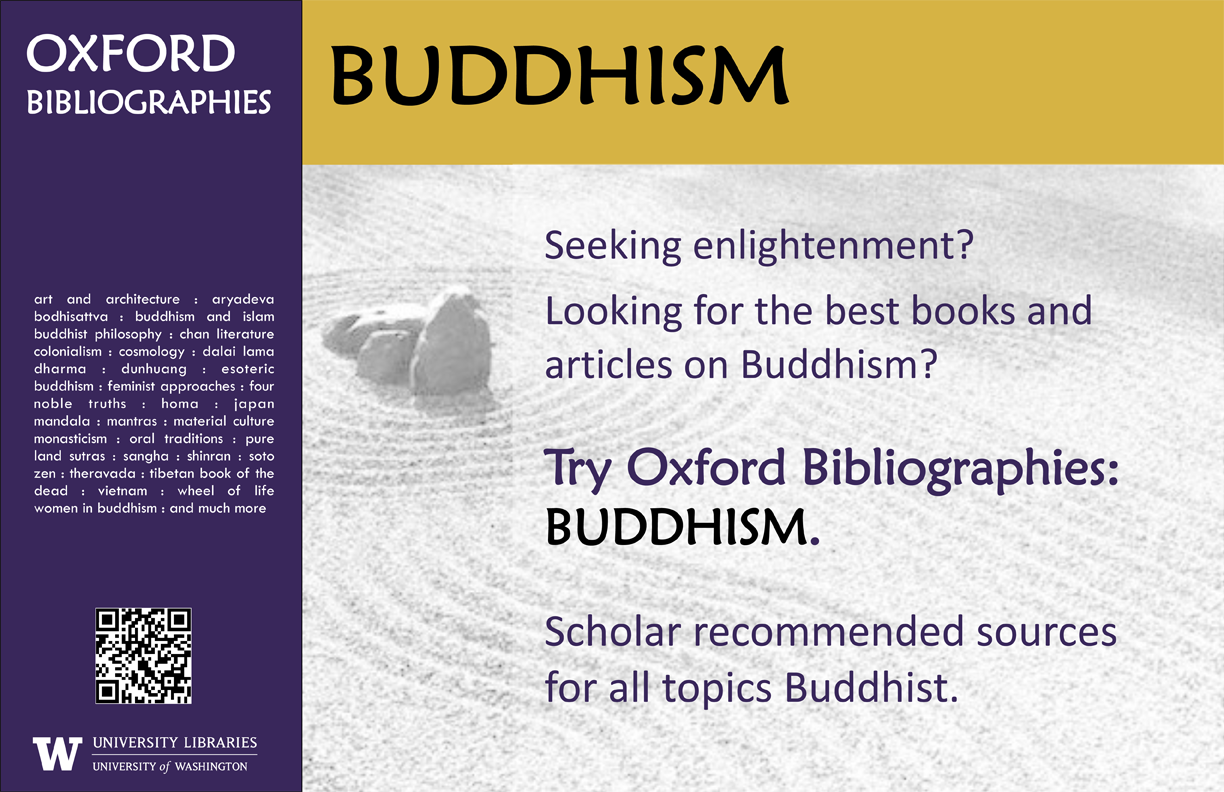
If your stacks are anything like ours then unused advertising space abounds. Our shelf end-caps have small signs with call number ranges on them and not much else. Theresa Mudrock and her colleagues at the University of Washington Libraries are “experimenting with posters in the stacks to highlight specific databases, subject guides and subject librarians.” It sounds like a fantastic use of dead space.
This poster, created on MS Publisher, promotes our newly acquired module of Oxford Bibliographies. Similar posters were made for other modules including Hinduism, Political Science, etc. The posters were placed in the book stacks in the call number areas for the subject.
It’s a simple but effective marketing technique. Users are already looking for books in a particular subject area, so why not point them to other helpful resources?
For the original Publisher files of these posters, email Theresa Mudrock.
 Awesome, Erica! If you’ve adapted any of the designs on our blog, let us know! We’d love to feature them here.