Search

Librarian Design Share

inspiration for library creatives

Tag

illustrator

Conference Posters: They Can Be Beautiful Too

Collective Engagement Poster

At our ALA Annual Conference Poster presentation for Librarian Design Share, April and I were so lucky to have our poster stationed next to the lovely Jennifer Brown, MSI candidate and University Library Associate at the Hatcher Graduate Library at the University of Michigan. If you aren’t familiar with the University Library Associates (ULA) program at the University of Michigan, this poster will give you a great introduction or you can read more about it.

In person, this poster sings! As you can see from the image above, it really is quite striking and beautiful. Jennifer’s use of color and alignment make it easy to read and lovely to see. Here’s what Jennifer has to say about it:

At this past ALA Annual Conference, my colleague and I presented on the unique partnership that the University of Michigan School of Information has with the MLibrary system. The University Library Associates program is a great opportunity for library students (like myself) to engage with the field professionally, and in ways that are sometimes absent in our library school curriculum. Further, seasoned professionals say that they benefit from learning and growing alongside us.

In the initial design phase, I began by selecting a color palette and layout that I thought appropriate for comparing two similar, but distinct, groups. I wanted to ensure that the theme remained consistent (which meant adopting a common shape, and threading that throughout the design), and tried to express quantitative and qualitative data visually, so as to draw the eye. I also made liberal use of public domain and creative commons licensed icons at The Noun Project, and generated the word cloud using a fantastic site called Tagul. Most importantly, though, I wanted to utilize white space thoughtfully, so as not to overwhelm individuals with too much all at once. In all, I had a fantastic time presenting this poster, and look forward to designing many more materials in the future!


If you’d like to see the Adobe Illustrator version of the file, you can email Jennifer. You can also download a large PDF version of the poster.

Now In Concert: Advertising Events in the Library

One of the challenges of advertising library events on college campuses is the non-stop barrage of publicity emails, flyers, posters, and announcements that fly around campus. Whether it’s the ultimate frisbee team’s bake sale fundraiser or the theater department’s latest dance performance, somewhere on campus someone is holding an event. The preponderance of “stuff” going on increases the need for targeted, engaging and attractive advertising for library events.

This is where our latest submission comes in.

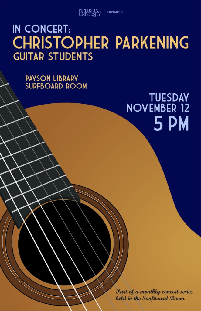
Brandon Scheirman, Marketing and Graphic Arts Associate at the Pepperdine University Libraries, created a series of posters using Adobe Illustrator advertising a guitar students’ concert, a part of a monthly concert series held at the library.

Guitar Series Poster Blue

My library holds a monthly classical guitar concert in one of its rooms and my job was to create a series of posters that advertised these concerts in a clear and classy manner. I wanted to go for a little bit of a retro feel that brought color and bold images to the library, which is something that the library has struggled with. These posters have been widely recognized across campus and brought the events together as a cohesive series.


Guitar Series Poster Green

Brandon’s posters are a beautiful example of unifying different designs through the repetition of common elements. In this case, he maintains consistent use of typography and imagery by repeating the same font in different colors as well as the same guitar from different angles. The library logo remains unobtrusive but still present, letting the fantastic, bold poster design shine through.

Guitar Series Poster RedIf you’re interested in learning more about how these posters were created or obtaining a copy of the Illustrator files, please email Brandon Scheirman.

Read the Rainbow

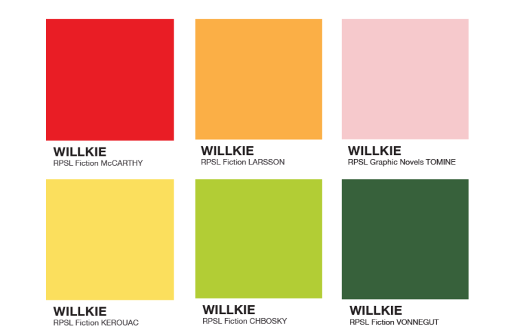
Read the Rainbow: Literacy in Pantone SwatchesWe’ve featured a few different book displays on Librarian Design Share since our blog began, and I have to admit they’re my secret favorite thing to post. I don’t really get the opportunity to create displays for my library, so I think posting other people’s displays is my way of filling a personal design void.

This fantastic display comes to us from Leanne Mobley, MLS Candidate at Indiana University and the Center Supervisor at the Willkie Library, Indiana University Residential Programs & Services Libraries.

Read the Rainbow: Literacy in Pantone SwatchesHere’s Leanne in her own words:

For the month of April, I put together a “Read the Rainbow” display to highlight our fiction collection. The display is an homage to the classic Pantone paint swatches. I rounded up a handful of books with vibrant covers and then used the eyedropper tool in Illustrator to select the main color featured.

I also ransacked the paint swatches at our local hardware store and covered our bulletin board. We mostly circulate DVDs and music, but our patrons are really enjoying the display and seem to be taking notice of our fiction collection.

Read the Rainbow: Literacy in Pantone Swatches

April and I both love classic look of Pantone color swatches and can easily see this display replicated in academic, school, and public libraries. Really any library with a fiction collection would be able to do this!

If you have questions about the display, leave a comment. For the Illustrator files that accompany this display, contact Leanne directly.

Tackling Ugly, One Food-and-Drink Policy Sign at a Time

If your library is anything like every library I’ve ever worked in or visited, you have at least one hastily created 8.5″ x 11″ flyer meant to disseminate some bit of library policy or rule. More often than not there are collection of these flyers in mis-matched fonts and color schemes across the library, devoid of any branding or cohesive theme, and let’s be honest, just plain UGLY. My library has ’em. Your library has ’em. We all have at least one example of a sign we pass on a daily basis that just makes us cringe.

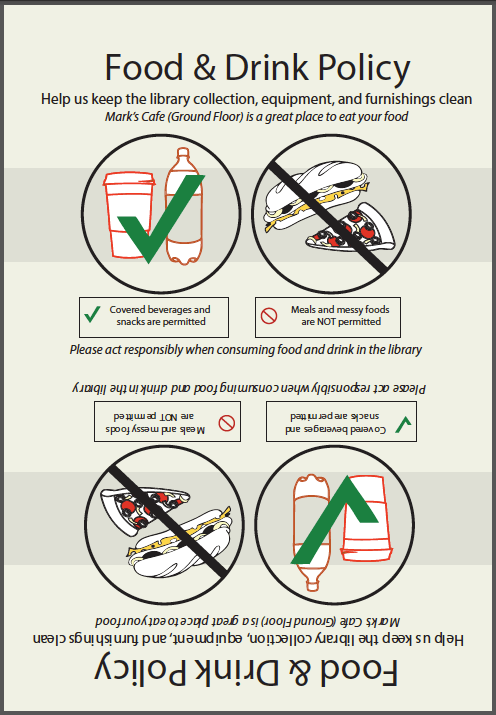
Melinda Roberts, Business Librarian at the Lippincott Library of the Wharton School at the University of Pennsylvania is tackling ugly in her library, one sign at a time. Her first target was this ancient Food & Drink Policy Sign:Old Food and Drink Policy Sign

Not good. Here’s Melinda’s take on things:

I’ve become the unofficial designer here at my library.  I’ve had no official design training other than attending workshops on several Adobe products. I’ve been trying to update some of our outdated signage around the library. One of the signs we’ve had for a long time is the Food & Drink Policy. The old sign is so full of text that I am sure no one is reading it! I designed a new one that is more visual.

New Food & Drink Policy Sign

We have small plastic sign holders that are 5×7, so I made my sign so that it can be printed, then folded in half. I try to save prep time in the design.

2-sided new food and drink policy design

For the original Adobe Illustrator file of this design, please email Melinda Roberts.


Mapping the Important Things

Whether we want to admit it or not, it’s quite likely that we all have a map in our library that looks a little something like this:

Old St. Francis College Library Map
The “Before” — Original St. Francis College Library Map

It’s descriptive, but difficult to scan, confusing to read, and not particularly visitor-friendly. Carolyn Li-Madeo at the St. Francis College Library in Brooklyn, NY took this original library map and turned it into a resource that’s not only easier for students and visitors to use, but clearly maps out the important spaces in her college library.

New St. Francis College Library Map -- Front
New St. Francis College Library Map — Front
New St. Francis College Library Map - Back
New St. Francis College Library Map — Back

Here’s Carolyn in her own words:

The library map is one of my most used tools at the Reference Desk. Prospective students and their families take copies as they pass through on tour, students and professors utilizing the library from other schools use it to find their way around, freshman locate quiet spaces to study and almost every student who comes to the desk for a  Reference Interview leaves with an annotated library map.

It was from these scrawled map notes — full of highlighter, arrows and call numbers — that I began to rethink how the map could better serve library patrons. So much of what the library has to offer students and professors is hidden behind a necessary veil of organization, however this organization tends to lead to an obstructive curtain of abstraction.

Map KeyMy goals with the redesign of the map was to ‘un-code’ the library collection by creating visual and textual entrance points for users. This primarily entailed adding subject headings by call number to the new map key and also the creation of a color coding system. You might notice that the subject headings are not all Library of Congress subject headings, instead some of the headings were changed to reflect the courses of study available at St. Francis. Additionally, many students study both nutrition (health promotion) and sports medicine, so these two divided sections were visually connected by the same color.

Other simplifications included the removal of ephemeral or highly detailed information that did not pertain to the physical collection. Individual tables (which often move throughout the semester) as well as computers were eliminated from the map.

Help Desk IconAdditionally, locations where students can receive help or assistance were united using icons and all three floors of the library were rotated to face north. This rotation caused the map to spill off onto the back of the page, a happy accident that allowed for a space to answer some frequently asked questions regarding library policy.

You can read more about Carolyn’s map redesign on her fantastic blog, Antelope as Document. You can download a PDF of her redesigned map, or email Carolyn for the original Adobe Illustrator files.

Work-in-Progress: Library Logo

SMCM Library Logo AttemptAfter undergoing a redesign this summer, our library’s website continues to be in a state of flux. Our current header design is not my favorite and I’m trying to come up with a new logo and header design for the library’s website. The above image is my first attempt but I feel like the bird alone doesn’t convey “library.” (Note: Our college’s mascot is the seahawk, hence the water-bird outline). Any suggestions?

Email Veronica Arellano Douglas for the Photoshop file of the logo or the Illustrator file of the bird.

Create a free website or blog at WordPress.com.

Up ↑