Search

Librarian Design Share

inspiration for library creatives

Tag

publisher

Evolution of a Handout

Recently a coworker asked if I could help revise a handout she made.  Her handout was fine and the information was good, but she was looking for a more graphical representation.  She also didn’t like that the handout spanned two pages:

notetaking1

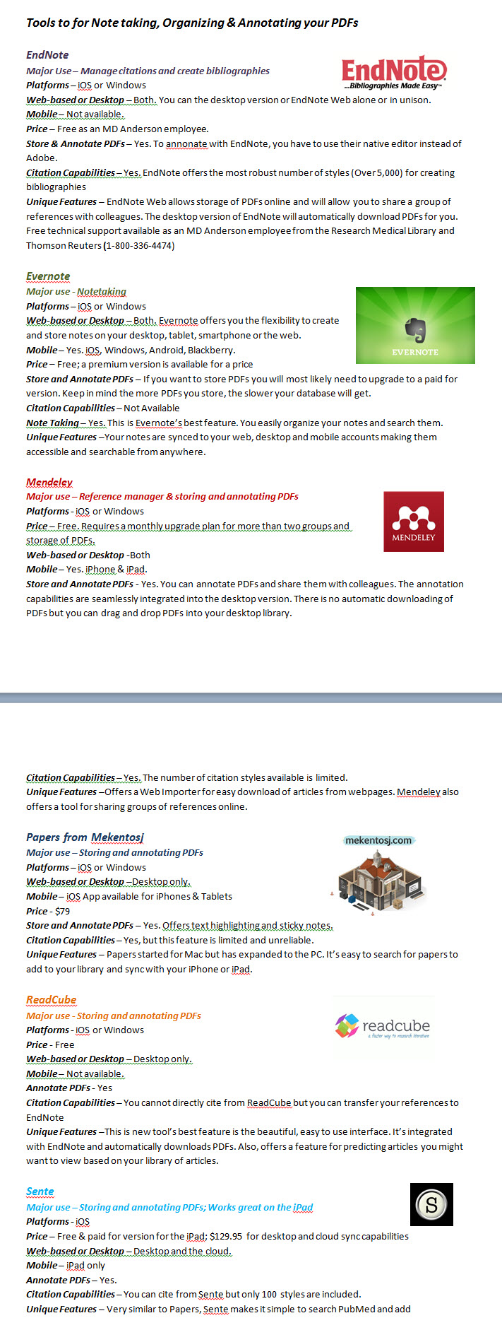
While we were discussing the updates needed, she mentioned that she really likes the way that Consumer Reports formats their product comparisons.  Since this is a handout comparing different tools for note taking, I tried to mimic their style and came up with this:

tools for notetaking2

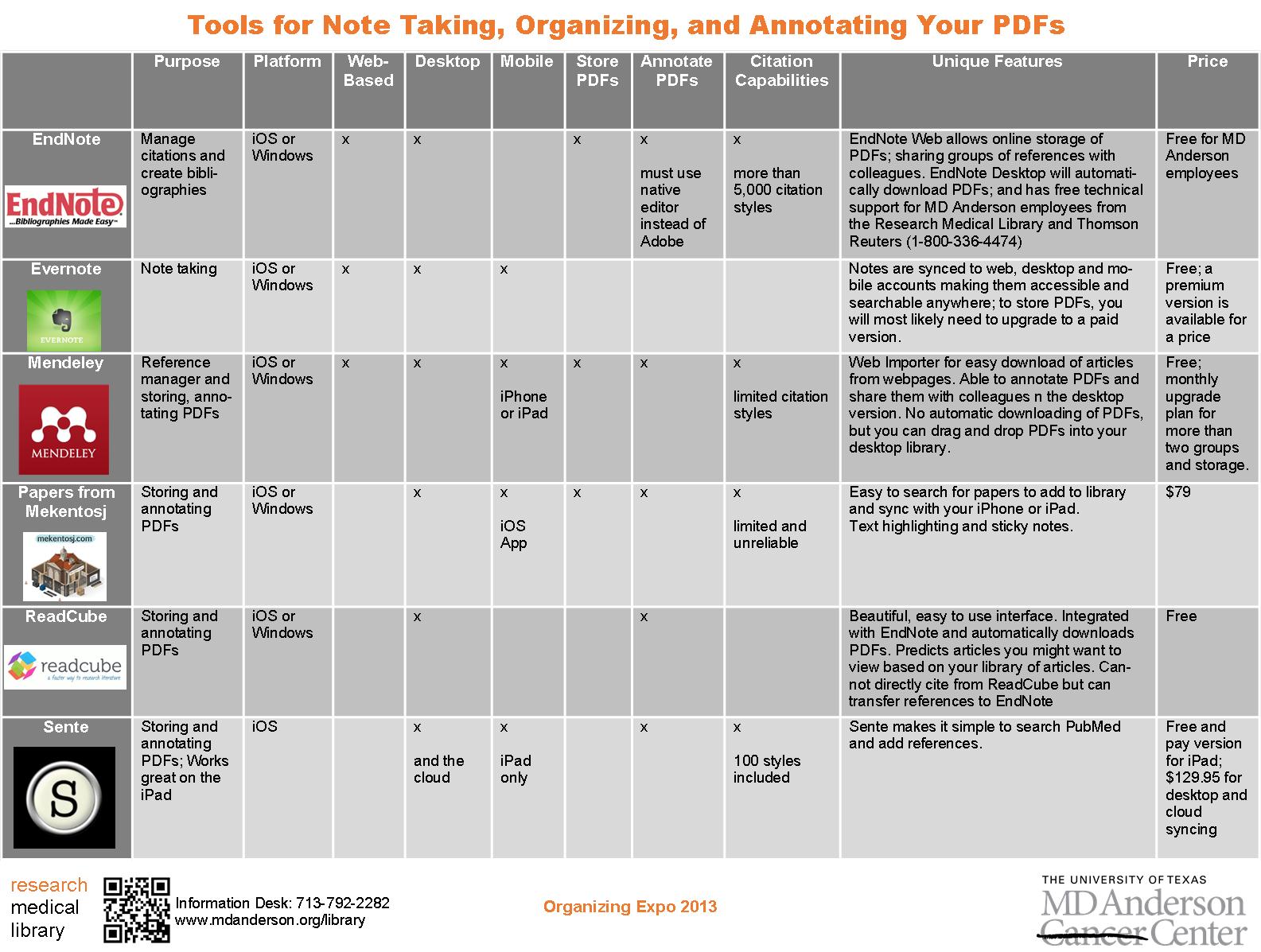
I pared down some of the information to fit it to one page and kept the logos.  But it still wasn’t quite right.  I couldn’t get the chart to size like I wanted it to in Word, so I copied it to Publisher, which allowed me to customize my colors and stretch the margins for spacing so that the chart was more eye-catching and easier to read:

tools for notetaking3

How do you guys feel about handouts–should they be one-page only?

For the Publisher file of this document, contact April Aultman Becker.

Promoting Classes

class offerings

Sometimes the most basic information can be the hardest thing to represent graphically. This flyer was created to promote our regular library class offerings.  Like a lot of the pieces I make, I utilized more than one Microsoft Office program.  I created the chart in Word because I prefer it over Excel for building charts with a bunch of text, and then I copied the chart to a Publisher document so that I could play with the colors, lines, and layer the images, which is way easier to do in Publisher than Word.  I’m not going to lie; it took me forever to decide on the colors and to fit all that I wanted to say in the limited space to make it a half-page document (color printer guilt), but now that it’s done, we can revise and reuse it each semester.

If you are interested in the Publisher file for this document, contact April Aultman Becker.

Advertising a Tablet Page

ipad front

When our staff developed a tablet page to highlight our mobile resources, we wondered how we would advertise it.  It finally became apparent that the very best way to advertise an iPad or other device was by using the image of the device itself.  What’s more eye-catching than a tablet?

I made a handout that is two sided: the front is an image of our actual tablet page as if you were holding and viewing it (I just layered a screen shot of the page over an iPad image–that’s what you see above), and a little more information and QR code on the back side (see the image below).  I print four of these per page to save some trees, and they are always popular at our Information Desk.

ipad back

The topic buttons on the handout were created by Laurissa Gann, Outreach Librarian at MD Anderson Research Medical Library.  If you would like the Publisher document for this handout, contact April Aultman Becker.

Image Out

This gives you a good idea about how I approach designing flyers…from the image out.  
flyer1

flyer2

flyer3

All of these images are Microsoft clip art that I inserted into a Publisher document, and then just started working around with colors, boxes, and fonts, while keeping my audience in mind.  I usually make at least three prototypes and then ask for input from colleagues before making a final decision.

So you guys tell me, which of these designs works better?  Don’t pay too much attention to the text just yet, nothing is final.

For the original Publisher files of any of the above, email April Aultman Becker.

Wednesday Meme Fun

LOTR Meme

From Gayatri Singh at the UC San Diego Library: Inspired by Teri Vogel, our chemistry librarian who used this image during an orientation, I made this sign (based on Lord of the Rings) for inside the library. We have a bunch of cement pillars that have sign holders on them. We usually post information about events and exhibits, but when it’s slow, we promote services.  [Memes are] somewhat topical, so you can’t keep them up forever.  And it’s fun to keep track of current trends and figure out how I can work them into library signage.

Contact Gayatri Singh for the original Publisher file, or create your own meme on Meme Generator!

Twilight-Inspired Flyer

reaxys

This flyer was to promote a special program for our scientists.  I made it during the height of Twilight fever, and though I’m not a Twi-hard myself, I was inspired by the simple, spooky look of the book covers.  For the Publisher doc, email April Aultman Becker

Pow! Bang! General Information!

WELDING

A long, long time ago at a job far, far away, I made this general information sheet for community college students.  I wanted to make it as graphic as possible to catch their eyes, but with as little text as possible because I knew I wouldn’t have their attention for long.  For the Publisher file of this doc, email April Aultman Becker.

LibCal Bookmark

bookmark

Are you using LibCal to book your study rooms?  It’s changed our lives around here.  This is the bookmark I created to promote our new self-booking system.  I’ve caught quite a few patrons around the library scanning the QR code with their smartphones to reserve a room.  Email April Aultman Becker if you would like the Publisher document.

General Information Sheet

general infoOur library was in need of a new information sheet, one that would reflect the changes in our logo, but also conform with our institution’s graphic standards.  This info sheet is the result of many, many revisions, and much input from our whole staff.  For the Publisher file or more information, email April Aultman Becker.

Create a free website or blog at WordPress.com.

Up ↑