
All libraries have rules and policies; it’s how we maintain a sort of organized chaos at our dynamic, community-serving organizations. However, expressing those rules to library users can present a bit of a public relations challenge: We want to be friendly, yet firm; accommodating, but not so laissez-faire that we no longer have a purpose and mission. We often communicate our library’s policies through some sort of sign or poster, but are we thinking about the tone we are setting with the design of those posters? Our message might be saying one thing, but the way it’s visually displayed and organized may be communicating a very different meaning.

If your library’s reference collection is anything like ours, it’s likely:
- underused
- overlooked
- full of fantastic info that makes librarians drool
My fantastic colleague, Amanda VerMeulen, recently created a series of shelf signs to try to draw attention to our in-need-of-more-than-a-little-love reference collection.

There are so many different ways in which libraries offer reference and research assistance, but it can often be a challenge to make sure that the people in our communities know about them all. Alex Ferguson, Reference Assistant at the Texas Tech Law Library created an all-in-one advertisement for all of the library’s reference help services.
It’s that time of year y’all. We’re desperately holding on to our summers when we know that in just a few weeks we’ll be deep in orientations, classes, workshops, and meetings. The important thing is that we’re not there YET and we still have some time to get in some great design projects, like today’s submission.
Dan Vinson, Coordinator of User Services and Library Assessment at Mount Mary University recently created some simple, easy-to-read, and attractive signs for the Haggerty Library & Learning Commons stacks. They’ve totally inspired me to start a similar project at my own library.
For those of us in academic libraries, it’s that time of year again: Finals Week (or impending Finals Doom, depending on who you ask). All of our laptops are checked out, extension cords line the walkways, and students begin appearing more and more disheveled as the week progresses. Our patrons are less interested in research help (all those papers were due last week!) and more interested in the amount of coffee needed to power through an all-night study session.
One thing that often changes during this time of year are our hours of operation. Extended hours during finals week, fewer open hours immediately afterward–all of these changes require eye-catching, easy-to-scan signage. Here are a few great signage submissions advertising library hours.
Edita Sicken, Instruction and Access Services Librarian at Manchester University’s Funderburg Library, used Canva to create the her library’s changing hours signage.
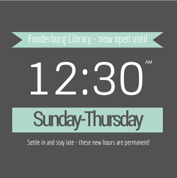
Here’s what Edita had to say about her hours signage:
I used Canva for all of these and none of them utilize any of their pay-per-use graphics. Some of the images used were our own, most of them are under creative commons licenses. I’m well-versed in Photoshop, Illustrator, and Publisher but Canva is really handy to use because of all the templates, filters, fonts, and graphic elements that are readily available. Plus there’s a mobile version available so if I’m out at a conference with my iPad and realize I forgot to get a promo image out, I can throw one together really quick!


Sometimes our library’s operating schedule can get a bit complicated, which means our signage often suffers from too much information all at once.
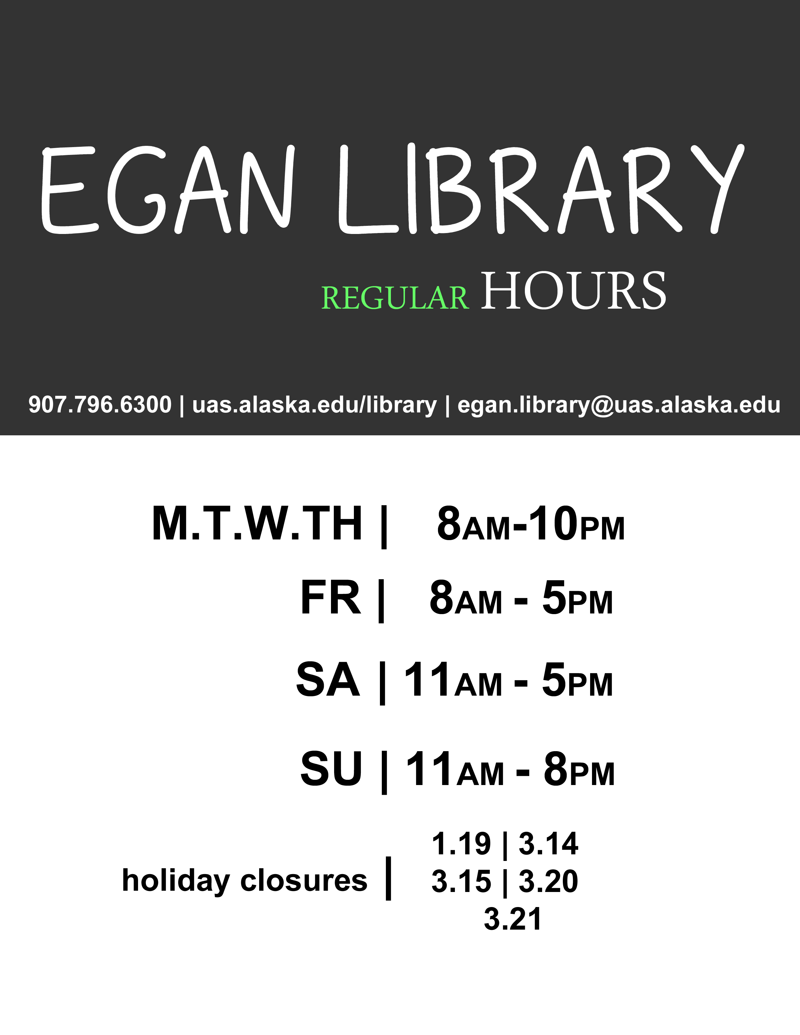
Jonas Lamb, Public Services Librarian at the University of Alaska-Southeast’s Egan Library, recently revamped his library’s hours signage using Photoshop. Here’s the old version, which, as Jonas mentions, “often got over complicated with intersession and holiday exceptions.”

You can see that the new versions follow a nice template with variations in color for different times of year. It’s a great way to highlight changes in hours while still maintaining a steady look and feel.

Here’s Jonas’ talking about this new signage:
I’d reached my wit’s end with library signage designed using Word, Publisher, PPT, etc and finally taught myself enough Photoshop to put something visually simple to refresh our existing signage. Around the same time we began using 4×6 acrylic table top-6 sided sign holders and an 80” digital display so I had an opportunity to re-use elements of the new design into a variety of sizes and layouts, subtracting text elements where appropriate.

What are your solutions to advertising modified hours of operation? Do you have other signage you’d like to share? Or better yet, signage you want to change but aren’t sure how it can be improved? Let us know!
PDF and JPEG versions of Edita’s Canva signs are available on the Librarian Design Share Google Drive, as are Jonas’ original Photoshop files. As always, resuse designs responsibly!
It’s cold in the Mid-Atlantic y’all. I’m trying to unfreeze my fingers by typing this morning, and what better way to warm up my joints than by sharing designs that tackle an issue we all wrestle with in our respective libraries: Noise. The best of libraries are filled with people reading and chatting, studying and collaborating, and this dual use can often pose a problem when some of our patrons want to converse and others want extended silence. I’ve found myself at either end of this spectrum (as I’m sure we’ve all been). I’ve been shushed and gotten the stink-eye from students for talking too loudly, and I’ve had to ask students to turn down their beats because everyone in their section of the library can hear the tunes blasting from their headphones.
Designating certain areas of the library as different noise level zones can help alleviate some of these noise conflicts, but good signage is key. Patrons need to be aware of the noise level preferred in different parts of the library, which is why I like this great submission by Michael Hughes, Instruction Librarian at the Coates Library at Trinity University.

Michael adapted the following graphic from the University of California, San Francisco Libraries (with permission) and incorporated a free icon into the design.

As an alternative, Michael also created the following sign, which, although busier, takes the same theme and adds a new twist on it.

What I love about all of these noise level signs and posters is the neutrality of language. Instead of “noisy” we see the terms “conversational study” or “active learning,” which I think motivates patrons to remain respectful of those around them.
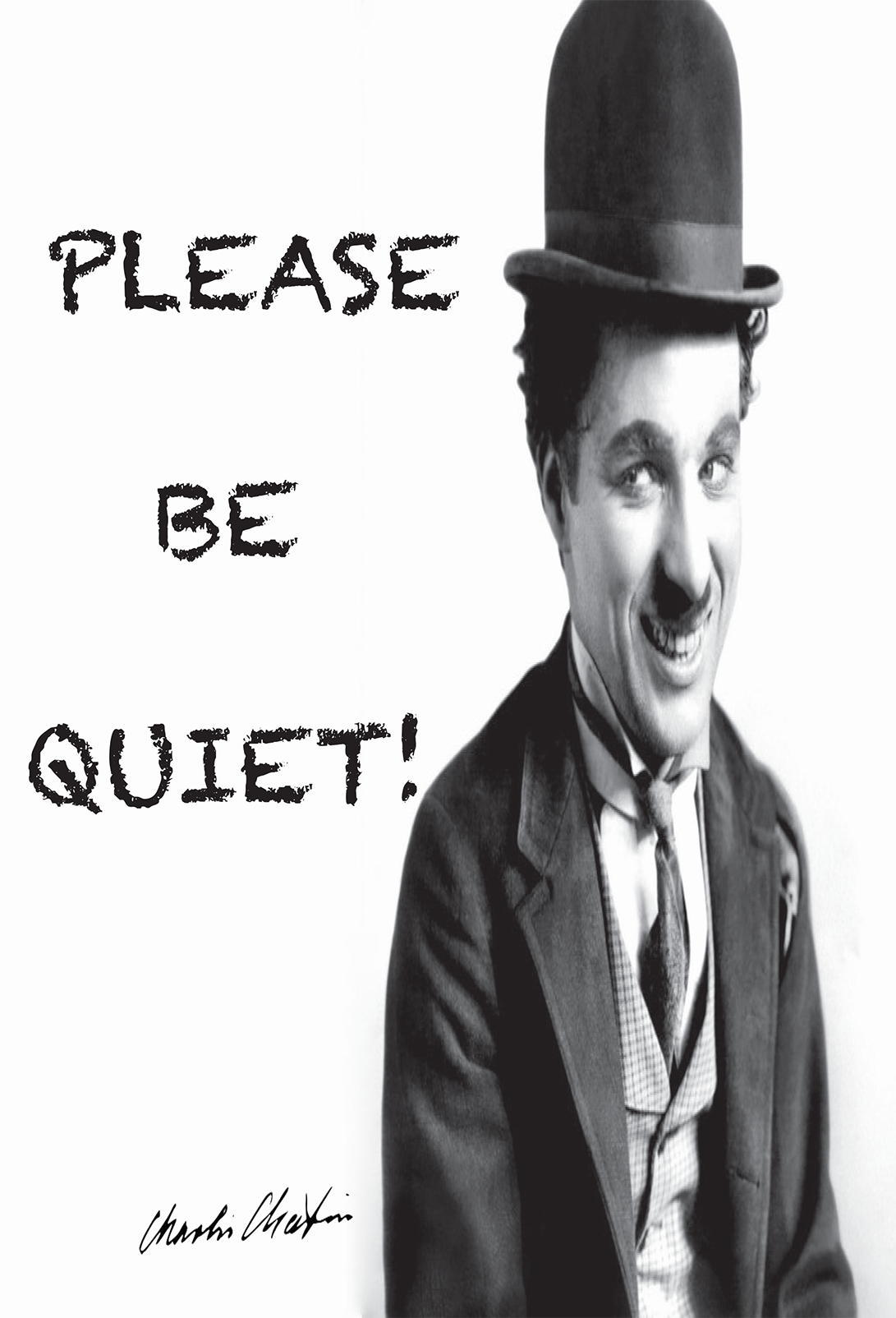
As an alternative, we have these submissions from İpek Yarar at MEF University Library in Istanbul, Turkey, which I think do a nice job of using humor to kindly relay a message for noise control. All three feature an iconic Charlie Chaplin movie still.


Do you have noise level signage at your library? What designs work best for your patrons?
You can find Michael’s original Photoshop files of his noise level signage and İpek’s printable signage (originally created with Adobe InDesign) on the Library Design Share Google Folder.
Like many libraries out there, my library has reduced hours during the holidays. This creates quite a bit of confusion for patrons, and it’s compounded when our signage looks like this:

Sure, all the information you need is right there, but it’s so hard to read. I made this schedule to hang outside the library, and after printing it, I realized how bad it was. I took the same information and rearranged it into a calendar format:
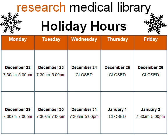
Way better, right? It’s so much clearer when we’re open and when we close early. The color and graphics make the sign just a bit friendlier too. It literally took 5 additional minutes to insert a table into Publisher and find the snowflake clip art than it did to make the block of text from the first sign. I’d say it’s worth the effort!
We’d love to see examples of revised signage you all have tackled. Submit your designs here!
Paseo Verde Library in Nevada has the same problem that many libraries do: patrons who loudly carry on phone conversations without regard for those around them. Instead of shushing or putting up passive-aggressive signage that no one reads, Virtual Branch Librarian Tawnya Shaw designed something that clearly conveys the message with an image that might just cause patrons to do a double-take:

To create this eye-catching design, Tawnya used Photoshop to alter a piece of Victorian clip art and Rockwell font for the text. The combination of image, font, and white space make this vintage design somehow feel very modern and effective.
Want to get the message out at your library? You can download the original files from the Librarian Design Share Google Drive Folder and modify as you wish.
There aren’t many things more tragic in a library than a flood. When our ceiling gave way last week to a giant black waterfall over our bound journals and public area, we could hardly believe our eyes. We’re still assessing the damage, but in the meantime, we have plastic sheeting hiding more than half of the library, loud noises, and confused patrons. It was time to present a unified message to ease the communication about what happened.
I wanted to keep the feeling of these signs in tune with our overall aesthetic and color scheme, and I wanted every person who enters the library to see them. I used the water droplet for the obvious reason that it graphically represents the gallons of water that flooded us, but I can also see it as a tear, and there were certainly a few of those as we sloshed through the mess last week.
I placed these half-sheet signs on all of the tables we have available. The message is light, helpful, and thankful.

On the front desk, I placed this larger sign to explain things a little more in details and to help our staff with the right words to say to patrons.

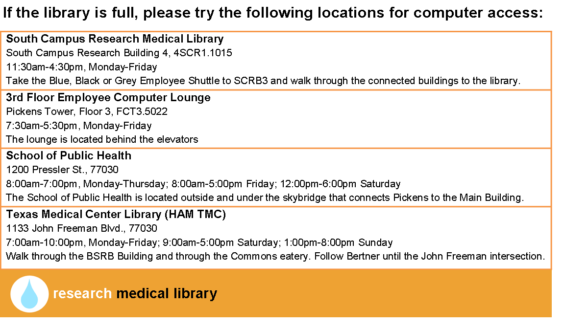
Finally, we are because we quickly realized that our limited space is not enough to fill the needs of our patrons (a nice problem because it illustrates our usefulness), I created this quick half-page handout to point out other computer areas nearby:
Of course this design doesn’t do much to make us feel better about what is happening in our library, but it does serve an important role, and does it better than a hastily printed sign might.
I hope you don’t ever have a need for these signs, but if you do, email me for the original files.
