
The Spring semester is like the worst kind of ninja: It hides in the shadows and then BLAMMO, it’s 3/4 over. It may be the first week of April, but if your library is anything like ours, you might already be planning Finals Week outreach and engagement activities for your campus community. With that in mind, today we’re sharing flyers and activities from Jess Burkhardt, Public Services Librarian at the DeSales University Trexler Library. Jess created all of these designs using Adobe Illustrator for Fall 2016 finals week, and is making them available to us all via the Librarian Design Share Google Drive.
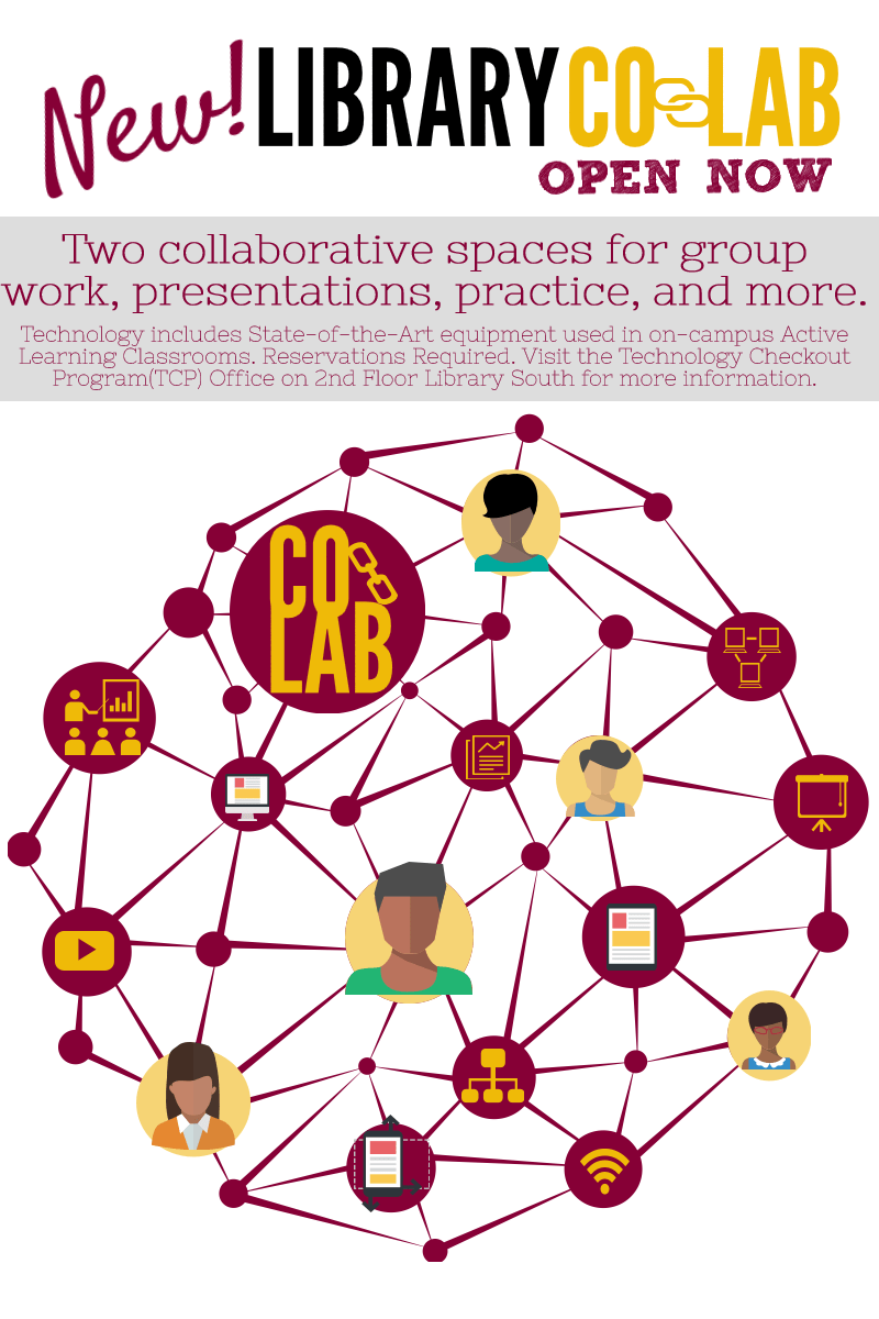
We’ve shared a lot of Canva designs on Librarian Design Share recently, but there are other easy-to-use graphic design sites with pre-made design elements like Piktochart that can help you create great looking posters and advertisements for your library. Kendall Hinesley, Liaison Library & Reference Coordinator at California State University Dominguez Hills, has created some wonderful marketing and outreach materials for her library’s new Co-Lab and Reference Services.
Librarians are always looking for creative ways to reach people and to inform our public about our services. I’m constantly changing up my brochures and handouts to look more modern and to contain more concise, relevant information.
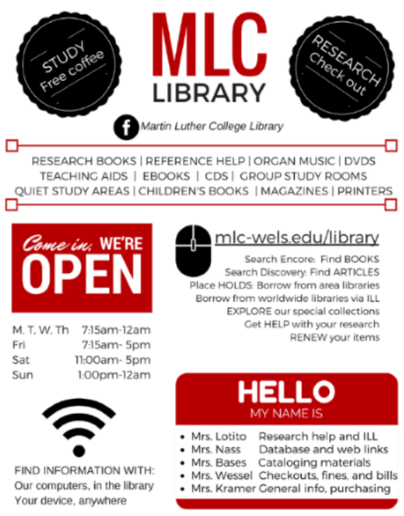
Linda Kramer, Library Director at Martin Luther College has designed a poster in Canva using simple colors and friendly, familiar graphics to attract the eye and promote her library’s services, hours, and people who can help. About this design, Linda says, “while being a resource for students, this was also handy as a basic information sheet for new faculty on campus.” Mission accomplished!
Some of us are lucky to have a library name that’s just made to aid in marketing. I work at the Bryan Wildenthal Memorial Library at Sul Ross State University, so I am not one of these people! However, Susan Bloom, Associate Librarian, Head of Instructional Services at the James E. Tobin (JET) Library at Molloy College definitely is! Susan has made numerous marketing designs for her library, but some of the best play off the JET theme:

The above services for patrons in the style of an airline departure board is immediately familiar and clever, as is the air-mail themed pizza party invitation below:

Susan explains her process and reactions from others about her designs:
All work was created by me using Photoshop CS6. I always get some emails from people saying how much they like them. I really love creating the fliers, it is very different from the other work I do and it allows me to flex some creative muscle. I always use Photoshop. I have tried using some other programs but they don’t give me the flexibility Photoshop does.
Susan has produced lots more library-related designs, and you can view those here. If you are interested in modifying Susan’s designs for your use, contact her directly. What about you guys? Has the name or a feature of your library inspired you in creation of designs? We’d love to feature them if so

One-half of Librarian Design Share is headed to Knoxville, TN to present at the 2017 Library Collective Conference alongside Amanda VerMeulen (St. Mary’s College of Maryland) and Dan Vinson (Mount Mary University). I’m super excited to be presenting with these awesome folks, and wanted to be sure to share our presentation slides, handouts, and other resources with Librarian Design Share readers. The focus of the conference is “Make it Beautiful, Make it Useable” which was all the sell I needed to attend. The conference schedule looks amazing, and I’d encourage you to check it out.
Here’s the info about our session:
Enhanced by Design: Creating user-informed, aesthetically attractive projects for your library
In this session participants will learn how different visual materials can address user concerns uncovered through focus groups, surveys, and ethnographic studies. Products created from data gleaned through these methods aren’t inherently beautiful, but by applying aesthetic design principles to these projects we can create products where usability is enhanced by design.
What this session IS about: basic user research methods, applying basic aesthetic principles/theories to creating visual materials, design-decision making
What this session is NOT about: in-depth session on graphic design or aesthetic theory,
how to analyze user research data (no coding, no stats).Some questions to think about before the session:
What is a problem you want to solve in your library?
What is a big picture question you have about your library/users/etc.?
You can check out our session slides below. It’s a mix of lightning style talks, discussion, activities, and Q&A. We hope the session will be interactive and fun, and we’re looking forward to learning from people who attend.
We also have a number of resources we’re sharing with participants, including:
- This fantastic LibGuide Amanda put together.
- Design Best Practices
- User Research Methods Glossary
- User Research Methods Chart
- From Text to Graphics Handout
You can also find all of the designs highlighted in this presentation on the Librarian Design Share Google Drive in the Enhanced by Design Presentation 2017 folder. If you’ll be at The Library Collective Conference too, stop by and say hello!
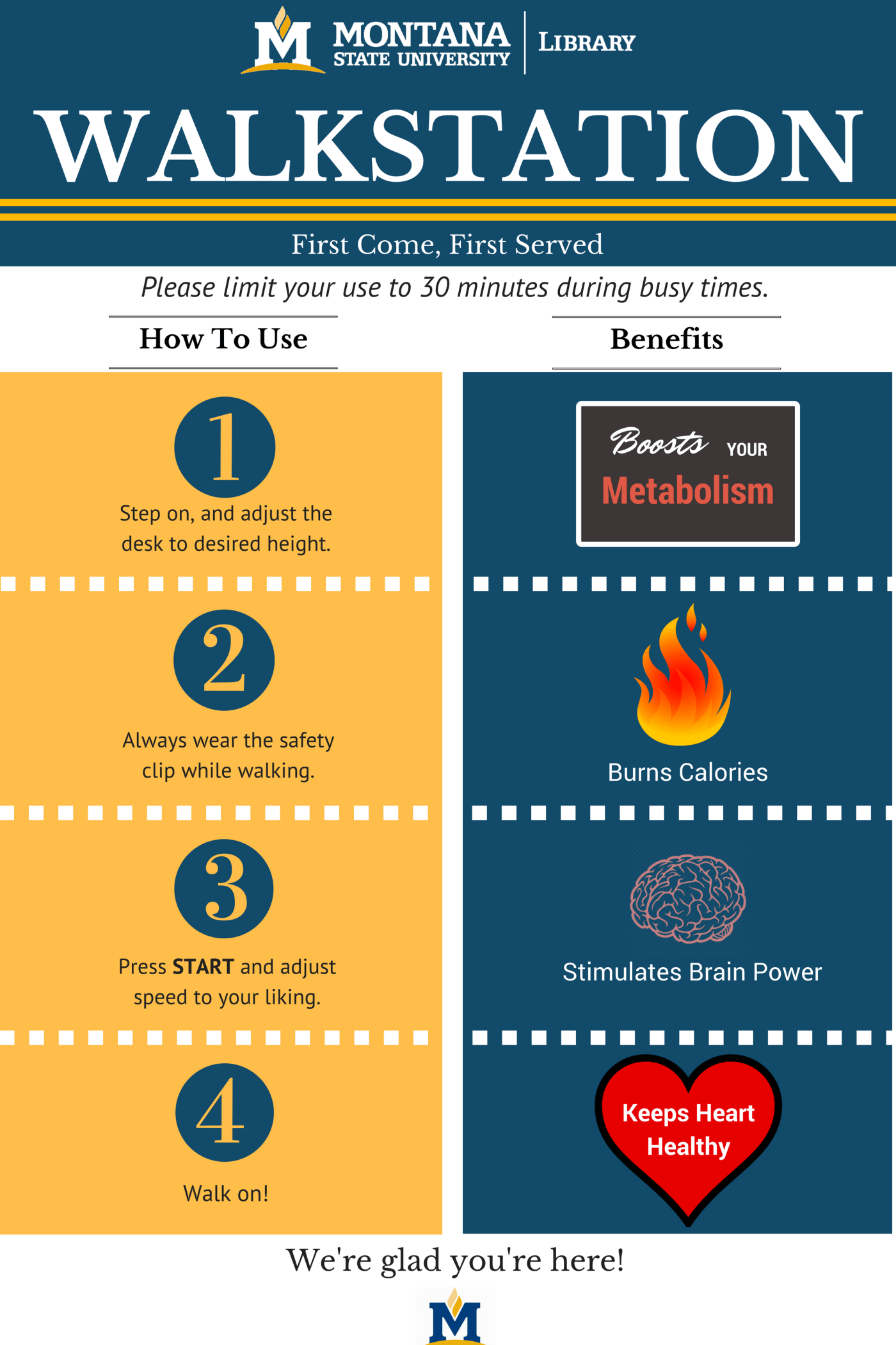
Today’s post is a little different in that we’re not just sharing a finished design, but showing and describing a design revision. This submission comes to us from Brittany Iverson, Learning & Research Services Librarian at Montana State University. A walkstation was recently added to the Library Commons, and Brittany was asked to create an infographic with how-to-use instructions and the benefits of walking while working. Here is the first draft of her work:

My library is in the midst of redesigning a number of things, and chief among them are building signs. Directional and informational signs are out of date in need dire need of a cohesive redesign, so I’m taking inspiration from today’s featured design by librarian Lina Rinh. Although currently at North Lake College, Lina designed the following endcap signs for the Hampton-Illinois Branch of the Dallas Public Library using Canva.

We’ve featured LibQUAL+ related infographics on Librarian Design Share before, and want to continue sharing examples of academic libraries that are making survey results public. Transparency is important, and the more we share what we do and how our users perceive our spaces, collections, and services, the more opportunity we have to make improvements.
Continue reading “Sharing Your Results: LibQUAL+Infographic”
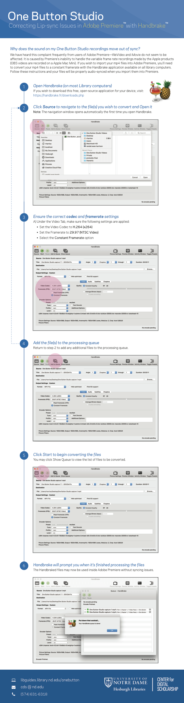
Last summer we featured a series of instructional materials by Randal Sean Harrison, Emerging Technologies Librarian at University of Notre Dame’s Hesburgh Library on One Button Studio. If you haven’t had a chance to see them, I highly recommend checking out that original post. They are a great example of clear, concise instructions in a visual format.
